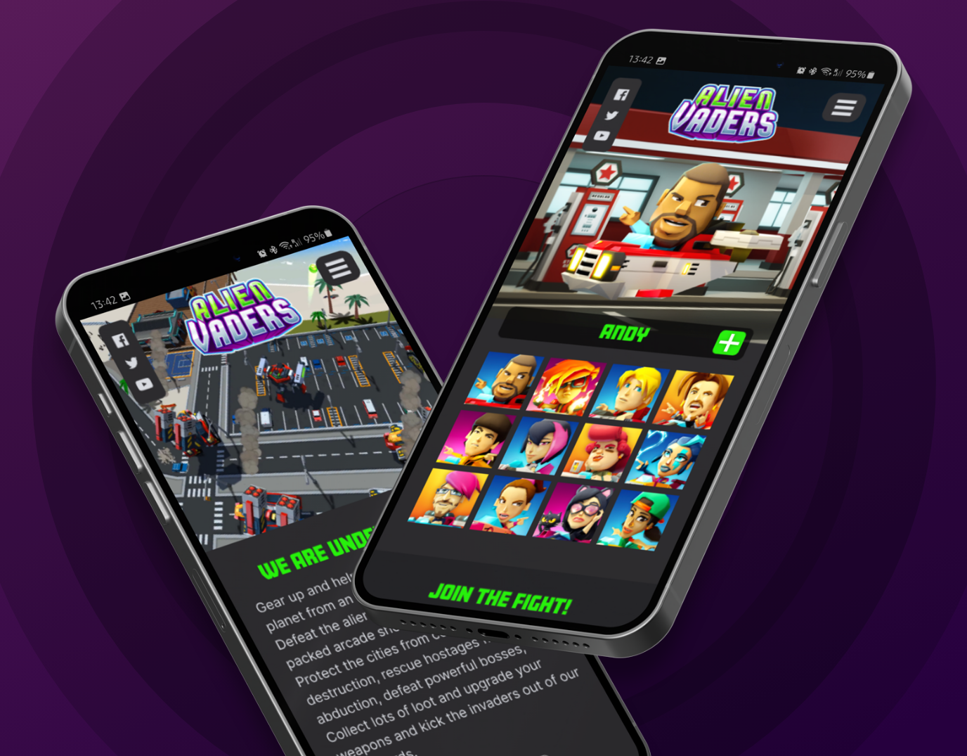
Project overview
Alien Vaders is an exciting game where players participate in a thrilling battle against relentless extraterrestrial invaders. The focus of this case study is to demonstrate the process of creating the game's UX and UI design, aiming to achieve an immersive and assist an intuitive gaming experience.
About this case study
The creation of a mobile app's UI design is inherently problem-solving, with a keen focus on easing user pain points and addressing their needs. We went deep into the user's journey, contemplating every aspect that could reinforce the success of our mobile game app.
Our design process was strategized to create an immersive experience by designing the game's screens and interactions and introducing unique layouts and details. Our goal was to captivate users not only visually but by optimizing experiences and engaging them in an interactive adventure, to keep them coming back for more.
This case study will briefly explore the methodologies and creative decisions that were part of the development of this UI project.

Last Iteration
September 2023
Tools
Figma, Adobe XD, Photoshop, Illustrator, After effects, Blender, Unity 3D
Client
Hooqt Games
My Role
UX/UI Designer and Game Art Director
My Responsibilities
Leading a small team of designers and artists, conducting interviews, creating paper and digital wireframing, low and high-fidelity prototyping, conducting usability studies, accounting for accessibility, iterating on designs and responsive designs.

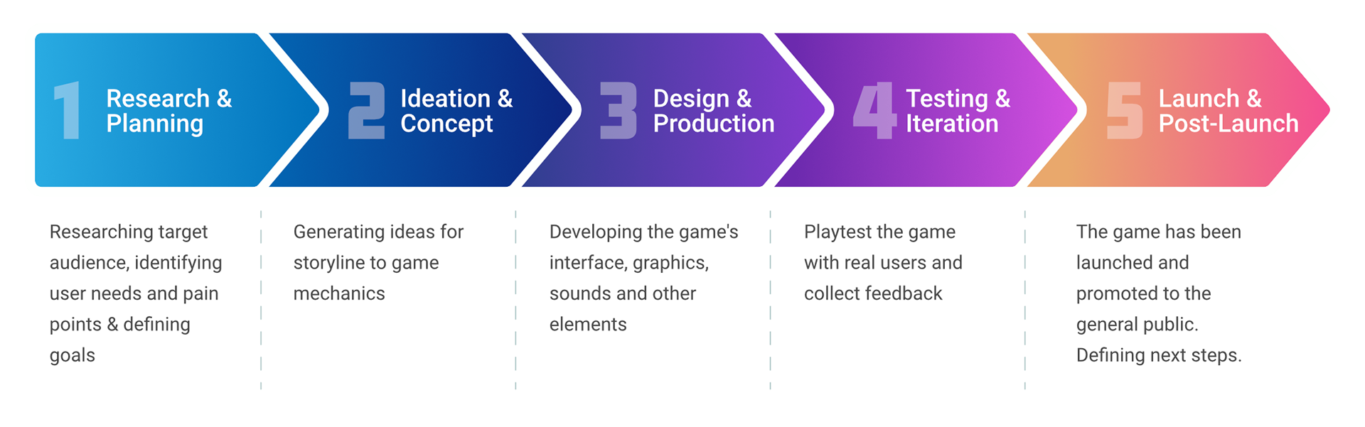
Design Process
Our design process followed a user-centric philosophy, prioritizing empathy with players to establish clear goals, inspiration, solutions, and develop adaptable prototypes. Following by usability testing for confirming the design's intuitiveness and enhancing the overall experience of the user.
Who are our users?
Before starting our designs for the game, our team embarked on a journey to gain a deep understanding of our user, and it was stablished that it is comprising predominantly male teenagers and young adults. This research was set to uncover some unique preferences, challenges, and behaviors that characterize our audience. Based on those results, we were able to ensure that our design decisions were based on our findings and tuned to their specific needs and desires.
The research produced several insightful findings that were helpful in shaping our game design strategy. One of our key discoveries was that our target audience showed a strong preference for competitive gaming elements, with a particular interest in leaderboards and achievement tracking. Additionally, we found that this group values social interaction within games, favoring features that allow for collaboration and competition with peers. Pain points identified included frustration with overly complex interfaces and a desire for more personalized gaming experiences. These insights directly influenced our design choices, leading us to prioritize intuitive navigation, customizable avatars, and integrated social features to enhance user engagement and satisfaction.
Personas
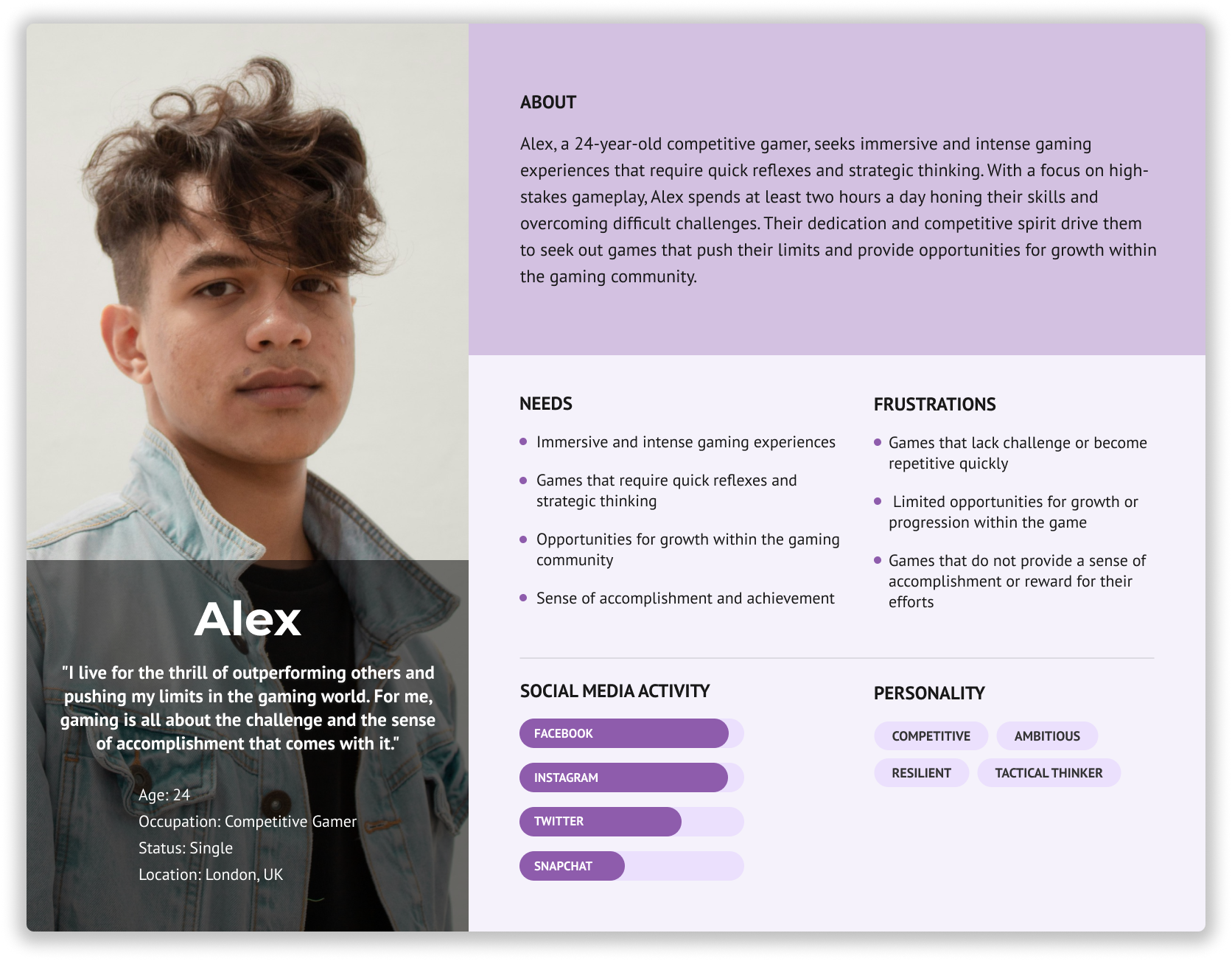
We utilized two personas created specifically for the game, which were informed by insights from our game design team. These personas, representing distinct user archetypes with particular needs, behaviors, and goals, guided our design process. They proved to be valuable tools for empathising with our users, guaranteeing that our solutions were based on their diverse set of challenges and aspirations.
Our primary persona is Alex, a 24-year-old competitive gamer who thrives on high-stakes gameplay and values quick reflexes and strategic thinking. Alex plays for at least two hours daily, seeking games that offer a challenging experience and a sense of accomplishment.
Alex represents the archetype of a dedicated gamer who prioritizes challenging gameplay and competitive environments. He is tech-savvy, often participates in online gaming communities, and is always on the lookout for new strategies to improve his play. Alex values games with high replayability and complex mechanics that require skill and practice to master. His engagement with "Alien Vaders" is likely to be frequent and intense, making him a key user to consider for feedback on game difficulty and design.
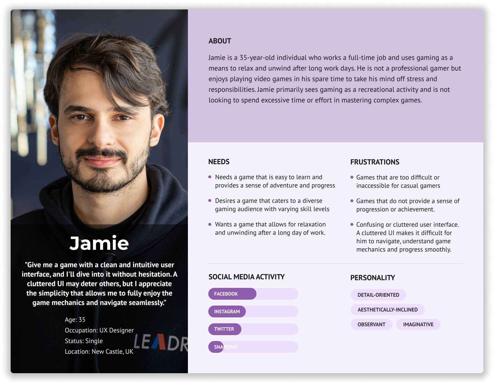
The secondary persona is Jamie, a 35-year-old casual gamer who enjoys playing to unwind after work. Jamie prefers games that are easy to learn but still provide a sense of adventure and progress. Both personas highlight the need for "Alien Vaders" to balance difficulty and accessibility to cater to a diverse gaming audience.

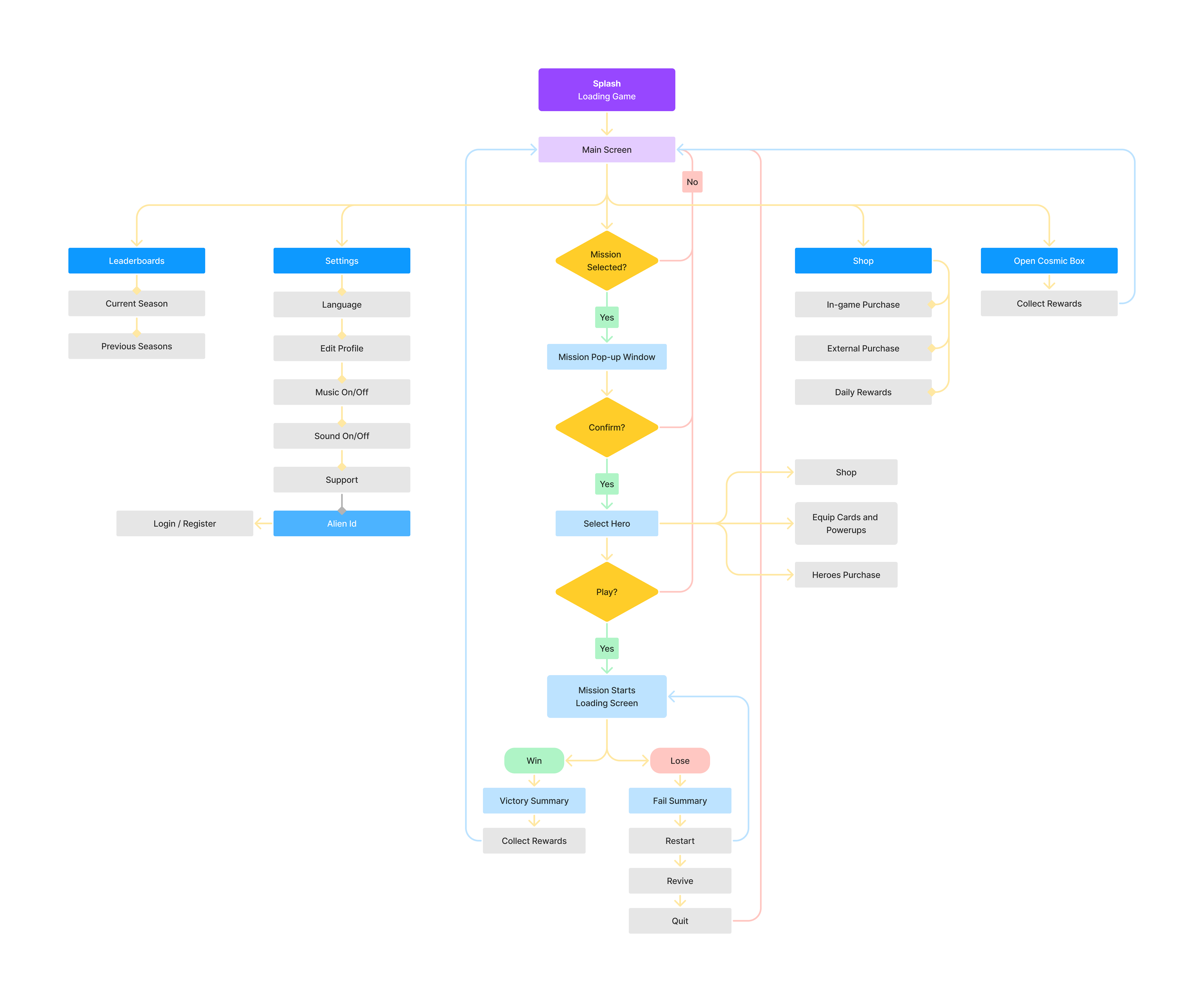
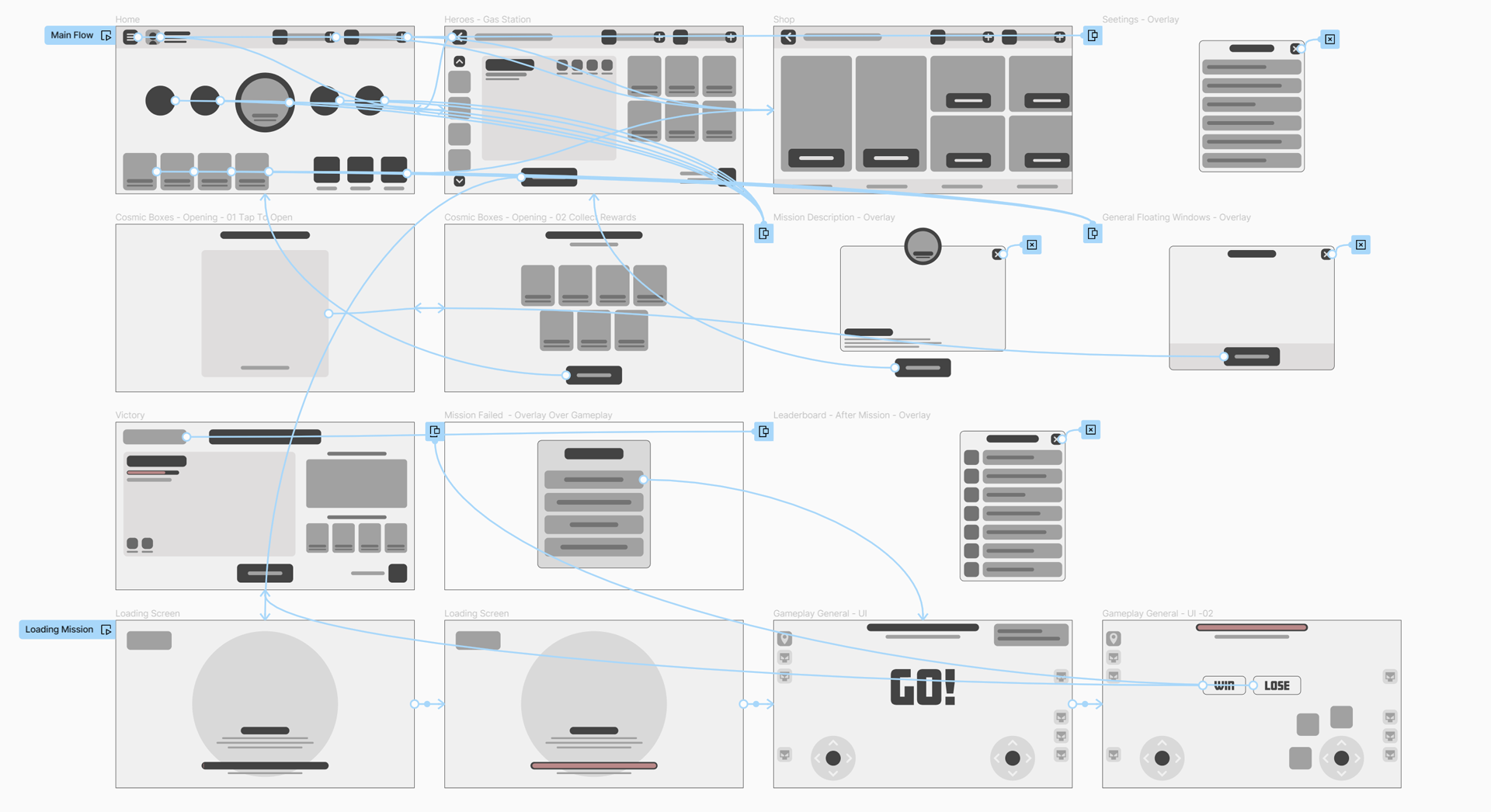
Information Architecture

DESIGN
Paper wireframes
Based on our personas and the architecture of the app, I started to create drafts of each of the pages, always keeping in mind user needs and pain points.
In our designs we prioritized the main menu page which should be easy to read and navigate as it would allow users to navigate to the most important parts of the app. Another feature we considered very important was the hero selection page, which we call internally ‘gas station’. The Gas Station is a place where we aimed to create a strong bond and empathy between users and our heroes.
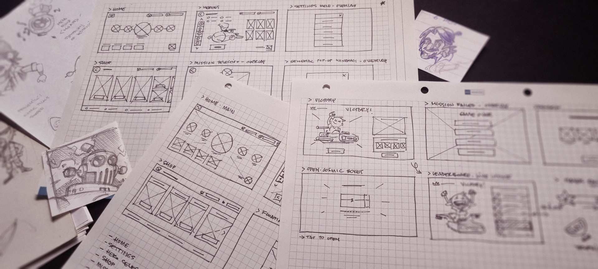
In our designs were considered the following features
Main Page
Player’s Profile, Settings, Leaderboards, Game Progress, Rewards, Shop and Loading Screens.
Pre-mission
Hero Selection, upgrades and resource management. Including easy access to our shop.
Mission
Gameplay flow and elements.
After-mission
Win/Game over screens and mission rewards flow.
Low-fidelity Prototype
Once our layouts were finalized and approved, we assembled our first prototype to evaluate the usability of the app. A flow supporting the main areas of the app was created so we could observe how users would perform a few tasks.
By designing for small-screen phones first, we intended to ensure a broad device compatibility and embrace a wider audience. This inclusive design strategy means that our product is well-suited for a higher number of players, fostering a more extensive and diverse community.

USABILITY STUDY
Findings
The initial testing phase has provided valuable insights, leading to a more refined approach for enhancing our design. Key improvements include:
1. The main page should work as the hub for various game features. It should offer easily accessible options for gameplay modes, player profiles, achievements, and settings. Users should be able to navigate through these options effortlessly, ensuring a seamless and intuitive experience.
2. A more linear and intuitive mission path is essential for quick understanding of our progression system. This point was of great importance to the game design team.
3. We should provide quick access to heroes and upgrades and enable more seamless transactions straight from the hero selection screen.
4. Enhancing the depth of information about heroes, their abilities, and items is crucial to significantly improve the user experience and foster empathy towards them.
5. Optimize inventory management to further facilitate gameplay.

Refining the design
Style Guide
Initially, our objective was to create a user interface that was both clear and intuitive, paying homage to classic arcade games such as 'Defender' and "Space Invaders'. The intention was to evoke a sense of nostalgia while incorporating modern elements. To achieve this, our initial designs featured sharp edges resembling pixel art. However, to enhance its modern appeal, we utilized gradients, shadows, and implemented subtle animations and effects.
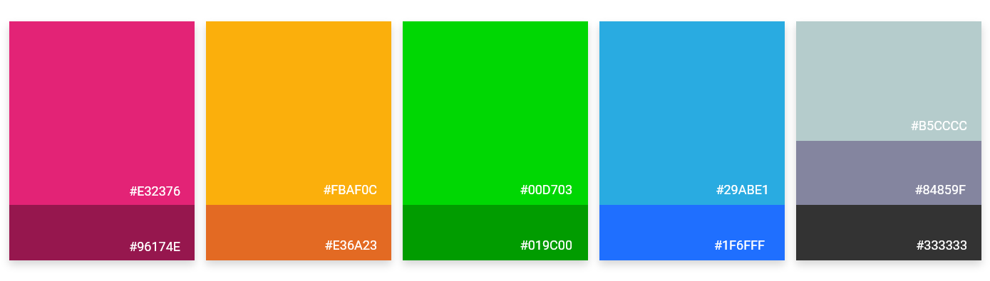
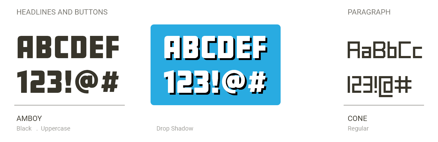
Given that Alien Vaders has a cartoony aesthetic, we opted for a vibrant color scheme and font faces that were in line with the overall style of the game. I took on the task of creating a color palette and selecting appropriate fonts that aligned with the game's vision, crafting each element to establish a cohesive visual style.
Color Palette
Typography
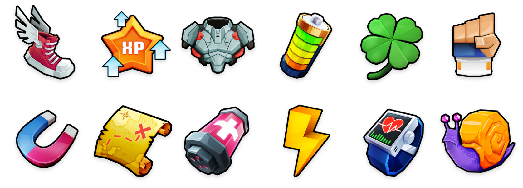
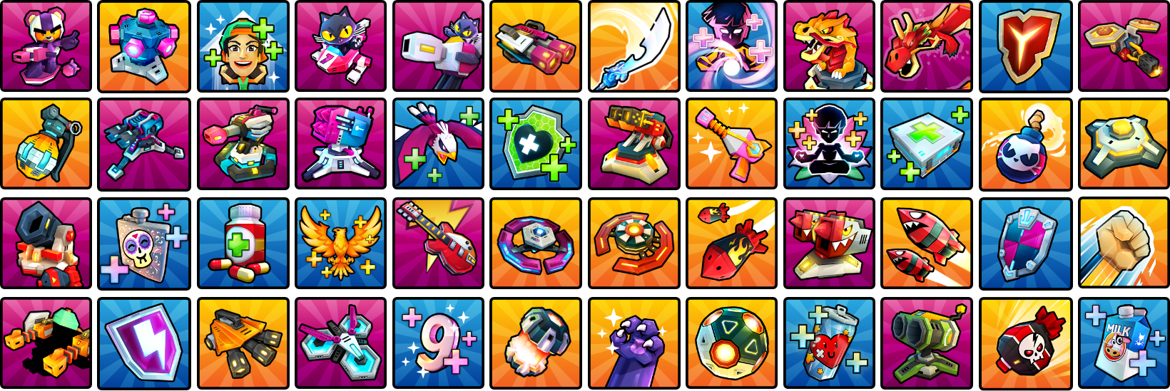
Icons
To facilitate user understanding, we used multiple colors to help differentiate various functions, especially on buttons. Additionally, we designed numerous icons to assist with quick identification of specific features.
Mockups
Main Page and Pre-Mission
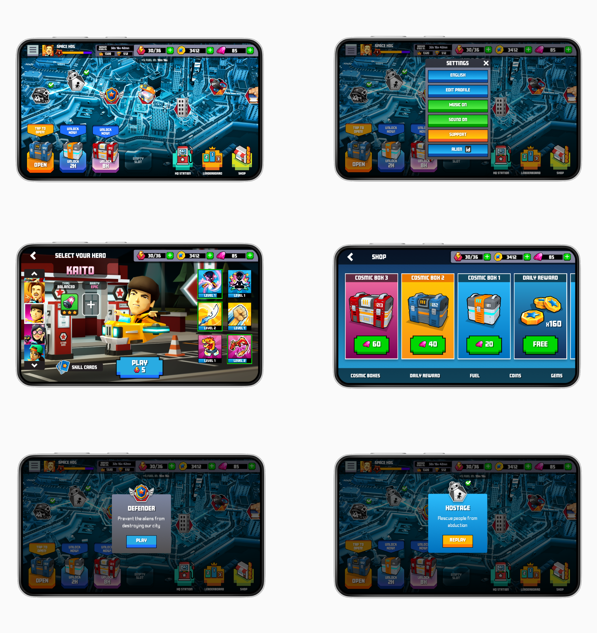
Following our usability study findings, we assembled mockups with the iterations to address user needs and pain points that had been uncovered.
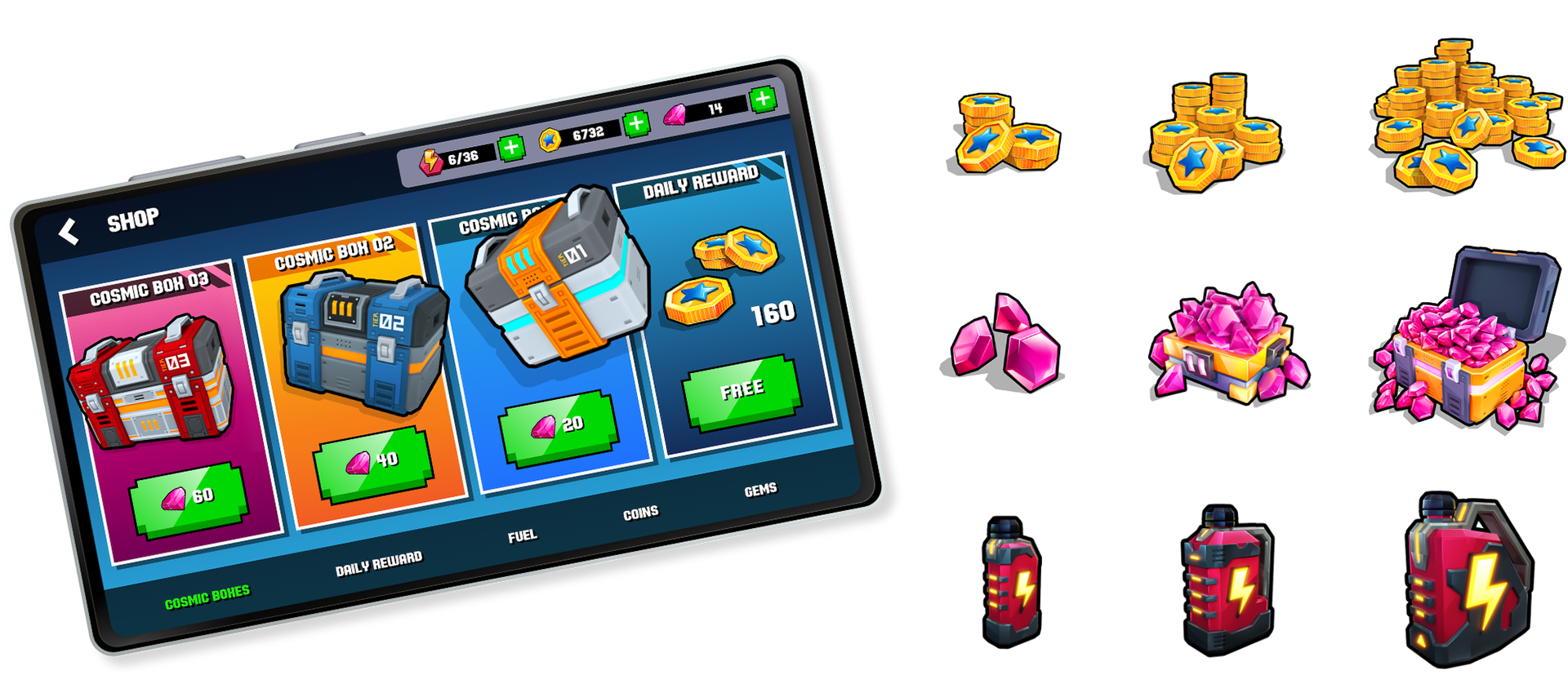
The player's avatar appears on the top bar of the screen, accompanied by details of her progress, season, performance stats, and current currency holdings. The currency bar offers quick access to the shop, directly to the selected item type and the resources can be easily accessed, acquired and managed as they are always visible on our main page, shop and hero selection screens. This is to facilitate purchases and improve the revenues of the game.
The game settings are located in the top right corner. Users can navigate to this section to edit their profile, seek support, register an account for the game, and modify various settings, including language, music, and sound effects.
A distinct mission path has been crafted to foster an intuitive understanding of game progression, providing players with clear visuals of upcoming challenges and rewards.
Cosmic Boxes obtained during missions are displayed at the bottom left of the screen, providing users with convenient access to them and the ability to collect their contained rewards.
On the bottom right, bottons have been placed to give easy access to some of the main parts of the game, such as shop and leaderboard.
A navigation bar has been added to the bottom of the shop screen, enabling users to easily locate shop's items.
Key Mockups
Main Page and Pre-mission
High-fidelity Prototype
Main Page and Pre-mission
Mission
During gameplay, the interface is designed to give players essential information like health, power-ups, and progress. With a minimalist design, our goal is to maximize screen space and avoid clutter, allowing players to concentrate on the game. We also implemented intuitive touch gestures and responsive controls, which are crucial for an enjoyable gaming experience.
To demonstrate the UI functionalities during gameplay, I've compiled a video featuring various moments where different segments of the UI are actively utilized. This dynamic approach makes it easier to grasp the concept.
Post-mission
Once a mission is successfully completed, the user is shown their performance, achievements, and rewards. A seamless flow is essential for the quick and effortless comprehension of the game's features and items, enhancing the intuitiveness of the gaming experience.
Below, the XD prototype displays the sequence of events that occur after a player successfully completes missions. It includes mission statistics, rewards collected, and the leaderboard standings update.
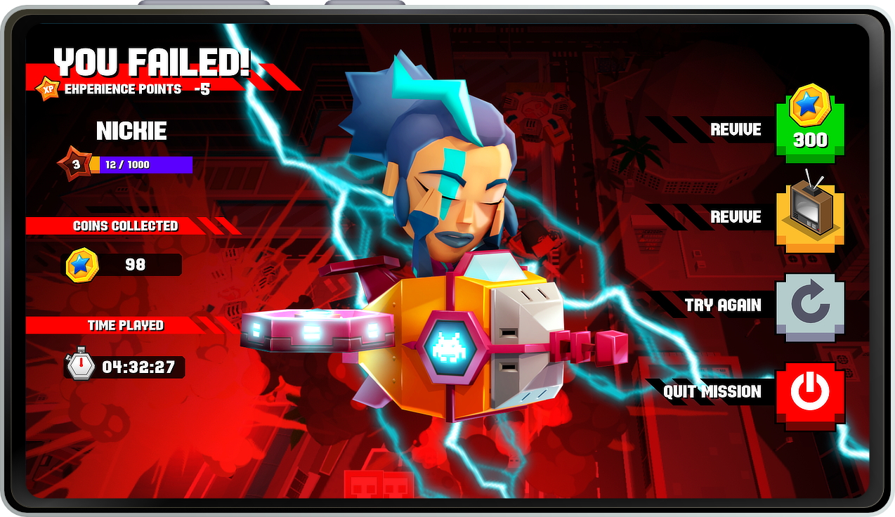
Should the player fail in completing the mission, the aliens persist in their movement in the background, while the screen adopts a red hue to highlight the failure. Meanwhile, the hero is prominently featured, enacting an animation of defeat.
The users are given several options to either retry or exit the game. To instill a sense of urgency and motivate them to purchase a revival, they are shown their achievements thus far and the potential losses if they choose to quit. This strategy is crucial for the game's revenue, as it nudges players towards making micro-transactions to proceed.
Conclusion
By carefully considering the UX wireframing and UI design process, we improved the Alien Vaders mobile game's user experience. Creating captivating visual elements, implementing intuitive interfaces, and focusing on smooth interactions that resulted in an engaging and immersive gaming environment. This case study is designed to lay a robust groundwork for improving the overall enjoyment and usability of the Alien Vaders game. Given the project's extensive scope, it was possible to showcase only certain selected aspects and features. The elements presented represent the essence of the project's development.

Takeaways
Game development environments are incredibly fast paced, with the potential for drastic changes to occur overnight. Should I undertake this project again, I would pay closer attention to this reality and strive to ensure that the UX project aligns seamlessly with the ongoing game development.
An agile UX design approach, with iterative testing and feedback loops reflecting the game development cycle, could prove advantageous. More regular interactions with the development team could ensure that UX is integrated into the game's core from the start. Keeping up with industry trends and player feedback is also crucial for a relevant and player-focused UX strategy. Such approaches could not only synchronize with the game development process but elevate it, resulting in a more unified and captivating player experience.

LET'S CONNECT!
Thank you for your interest in my work! Should you have any inquiries or wish to share some thoughts, please don't hesitate to reach out.