
Project Overview
The Game
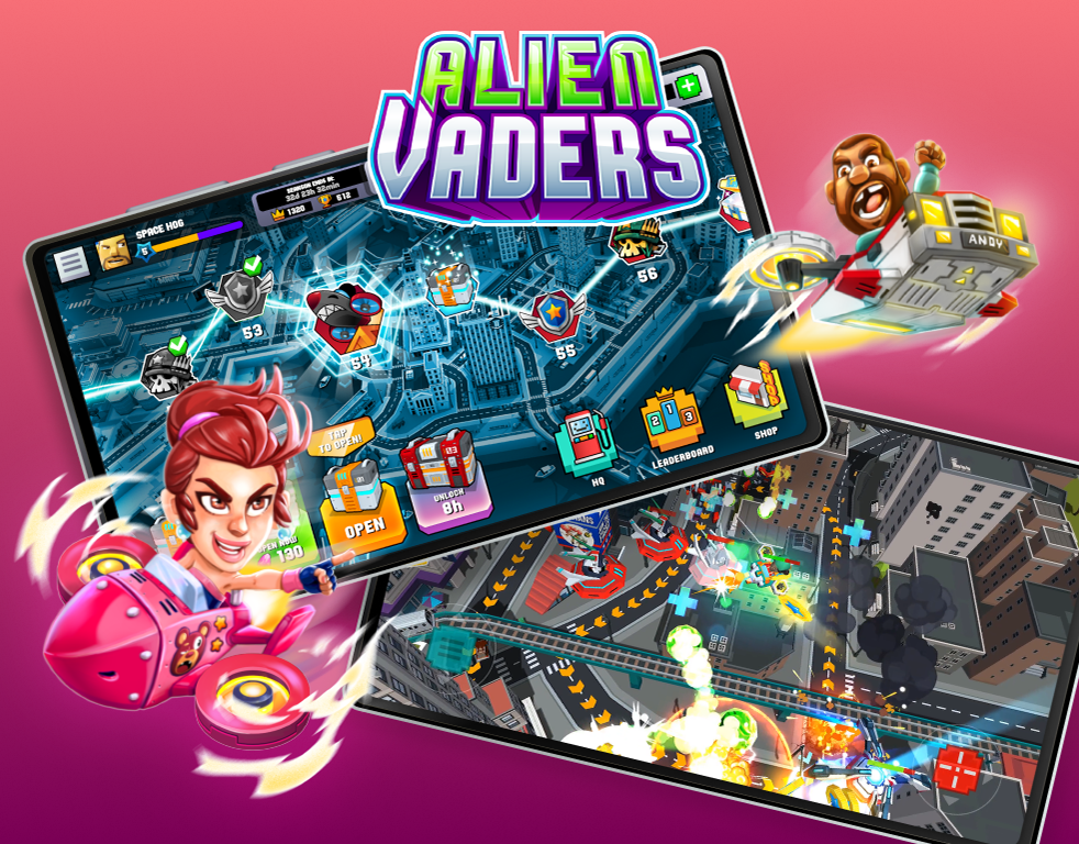
"Alien Vaders" is an exhilarating mobile action-shooter game that puts your reflexes to the test. As a member of the valiant resistance, you'll engage in a relentless battle against extraterrestrial invaders bent on Earth's destruction. The resistance boasts a colorful cast of characters, each with a unique history, personality, spacecraft, arsenal, and special skill set. Whether driven by the pursuit of honor or wealth, they unite under one noble cause: the salvation of our world from the looming alien threat.

Project Duration
June - August 2022
Tools
Figma, Adobe Photoshop, Adobe Illustrator and Adobe After Effects
Client
Hooqt Games
My Role
Game Art Director and UX/UI Designer
My Responsibilities
Conducting interviews, creating paper and digital wireframing, low and high-fidelity prototyping, conducting usability studies, accounting for accessibility, iterating on designs and responsive designs.

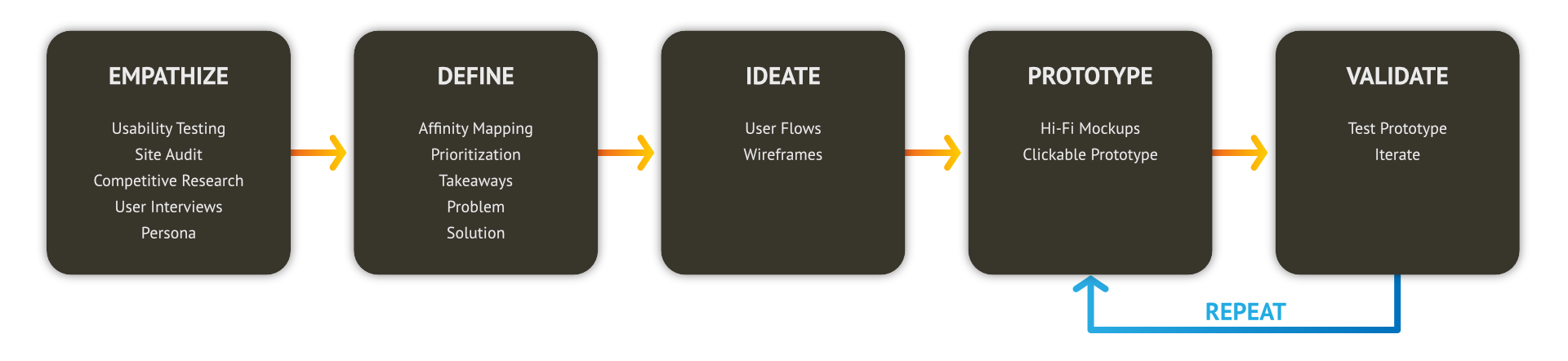
Design Process
Adopting a user-centric approach, the website design empathized with players to define clear objectives, ideate innovative solutions, and prototype responsive designs. Usability testing was then employed to validate and ensure an intuitive and enjoyable user experience.
Brief
Design a dynamic and user-friendly website that highlights the game's features, unique graphics, and immersive gameplay. It will be structured to captivate visitors, drawing them into the game's world. A clear call to action will encourage visitors to download the game, aiming to convert visitors into active players efficiently.
Challenge
The website should represent the game, reflecting its theme, genre, and style to create a sense of immersion and excitement. It must be compatible with different browsers and platforms to ensure a smooth experience across devices.

Understanding the User
Research
Summary
We conducted interviews and created empathy maps to better understand users' needs and pain points. Since the primary goal of the webpage is to convert visitors into players, we aimed to identify factors influencing game downloads. Our interviews revealed that users seek quick access to information about the game, its graphics, and gameplay. A failure to provide this information swiftly can lead to user frustration and a sense of wasted time.
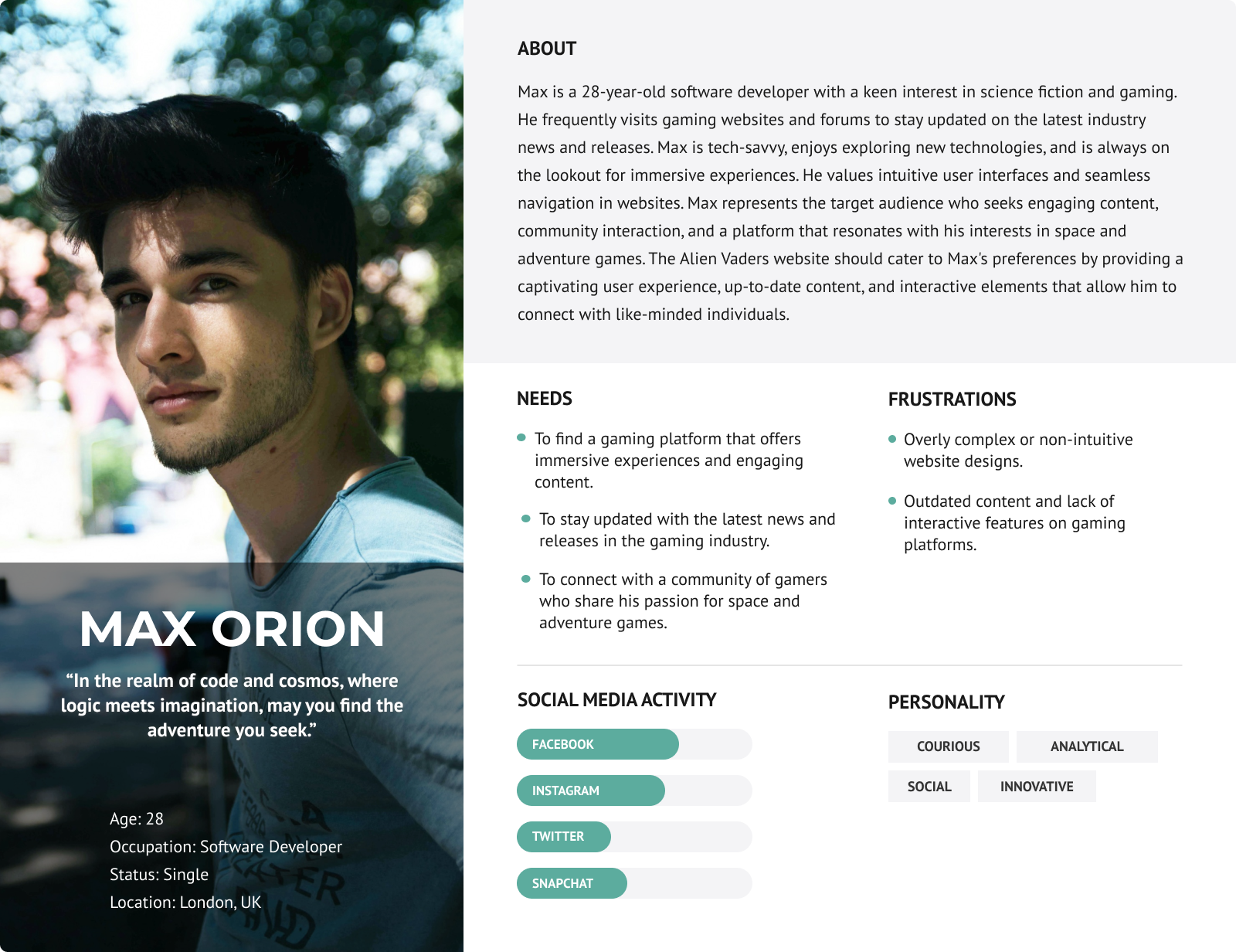
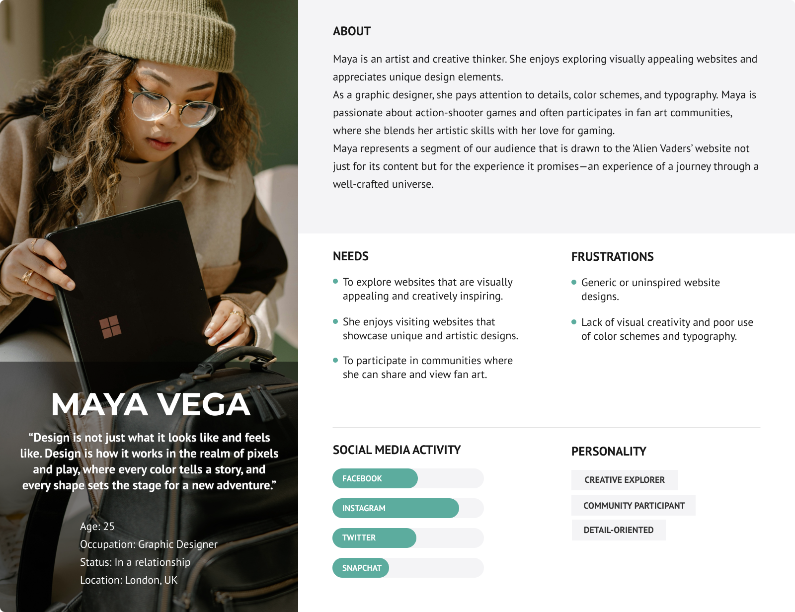
Personas
Data from our research guided the development of two distinct personas representing potential player demographics. These personas, particularly our primary persona, Max, directed our design choices to create a user experience that resonates broadly with potential players.

Designing Solutions
User Flow
We hypothesized that a straightforward user flow is crucial for converting visitors into players. We featured a video banner at the top of the landing page to engage players with the game's visuals. Below it, we placed download links, followed by detailed game information. We also integrated a simple subscription option to grow our mailing list.
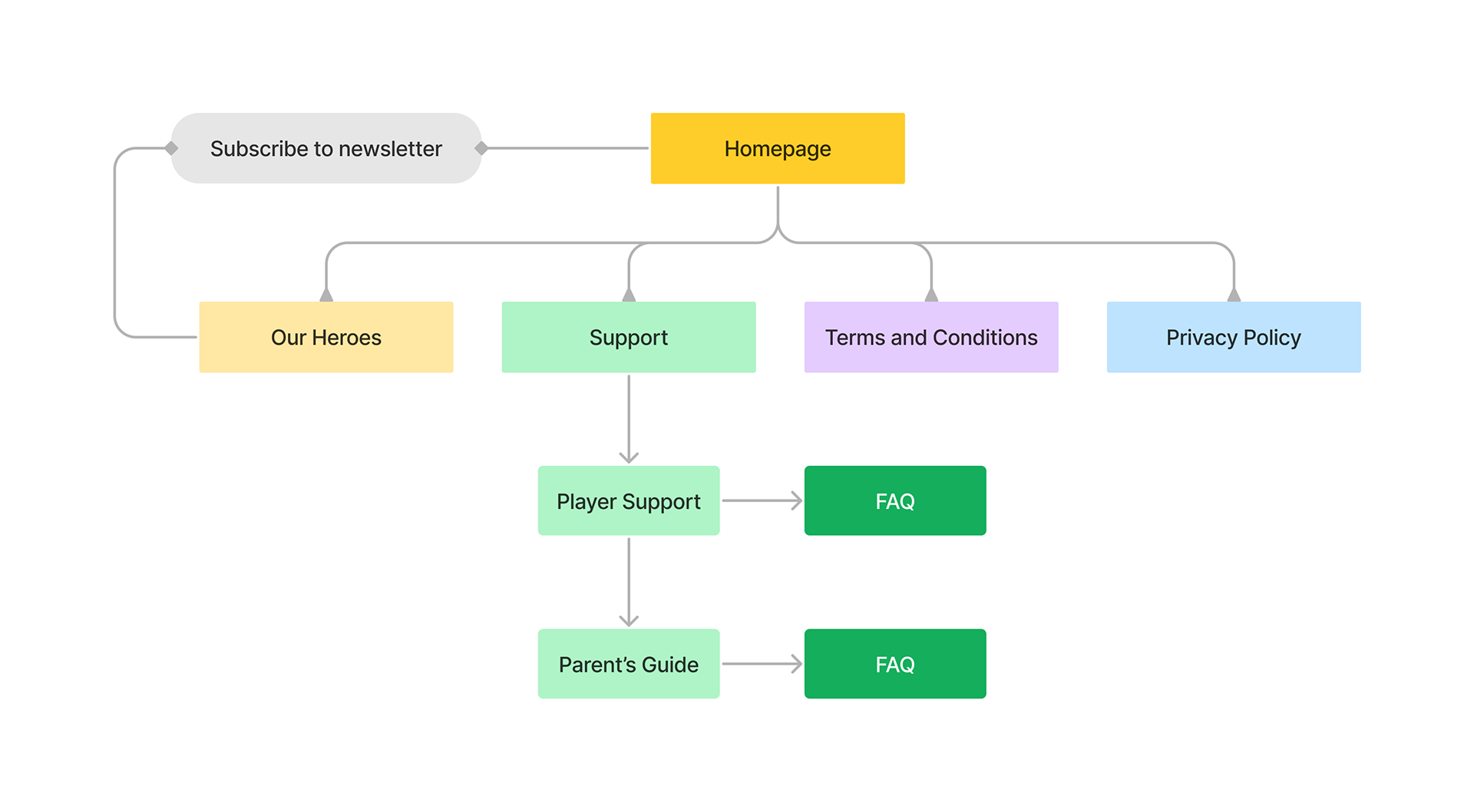
Site Map
Early Sketches
To enhance our website's effectiveness, I developed various iterations of each page to evaluate diverse strategies and refine our established solutions. Additionally, I designed the screen flows with a keen focus on user requirements, aiming to optimize the conversion of visitors into active game players. This user-centric approach was to ensure that we address our user needs while also achieving our conversion goals.
Digital Wireframes
Shifting from paper to digital wireframes has helped our design process, enabling us to craft our pages with precision and cater to user requirements more effectively. This transition was of significant help to the user experience and the boost of conversion rates. By strategically positioning key visual elements on the homepage, we've aligned our design with both our objectives and the users' expectations, ensuring a seamless and engaging interaction from the first click.
Low-fidelity Prototype
To create the low-fidelity prototype, I integrated the website's primary pages to establish a user flow that is intuitive and straightforward. At this point I had received feedback from team members regarding my designs and strategic placement of essential page elements, ensuring that their insights were considered in the design. Their collaboration was essential to effectively address user pain points.
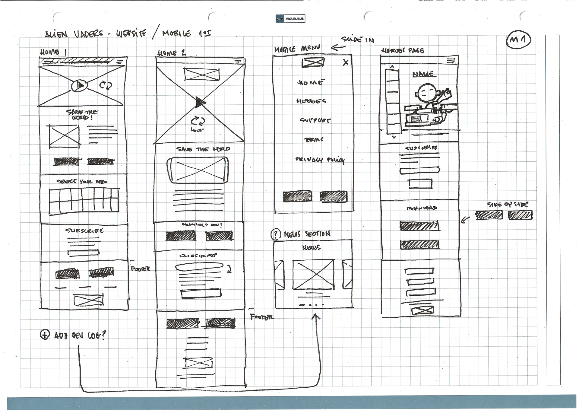
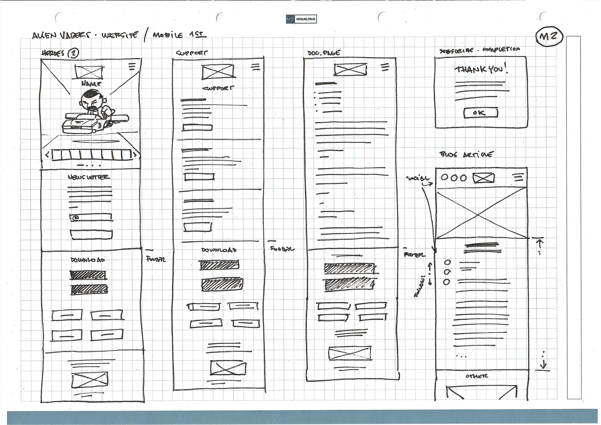
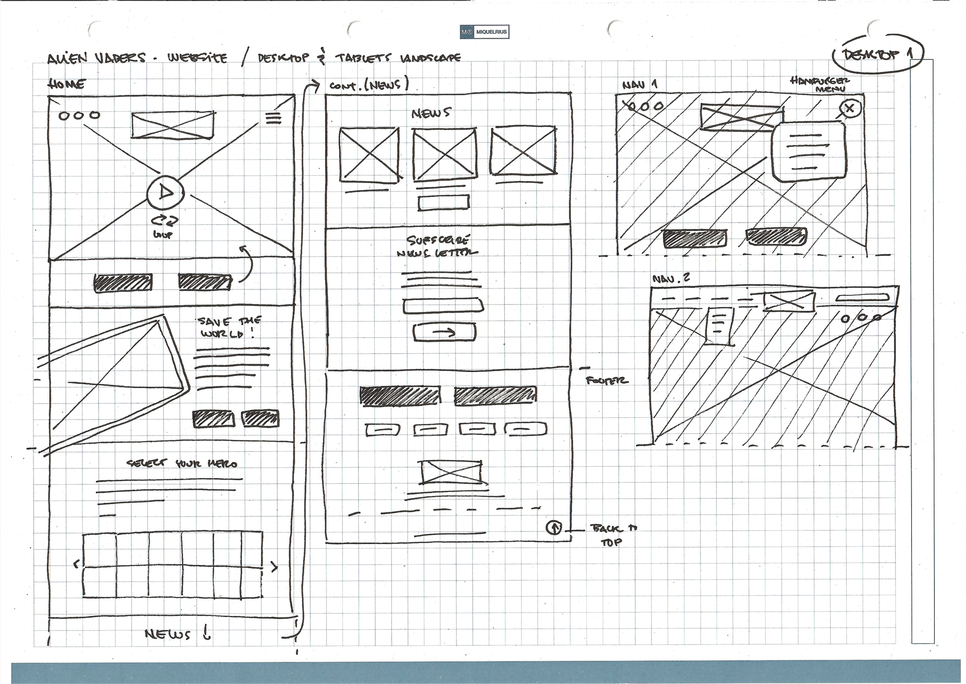
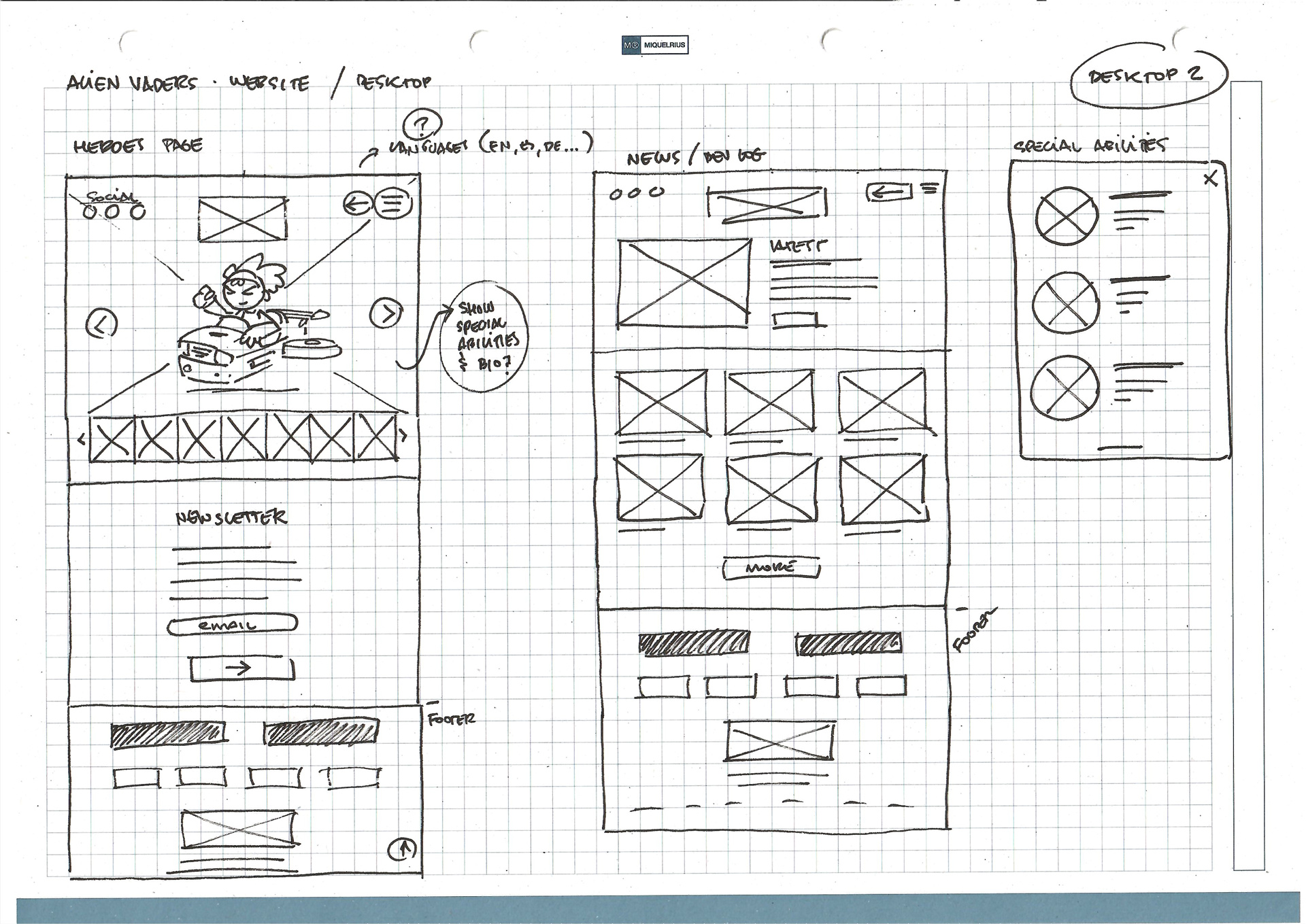
Given the characteristics of the product we represent, our team has adopted a mobile-first approach to our initial designs. Acknowledging the increasing dominance of mobile traffic and its influence on user experience, we began by developing a low-fidelity prototype designed for mobile screens. This ensures that essential features and content are given priority and are displayed effectively, even within the limitations of smaller screens.
Subsequently, we expanded the initial design to accommodate a desktop version, which allowed us to compare and refine the user interface across different devices.
Focusing on content availability and optimal user experience from the smallest to the largest screens allowed us to reduce development time and costs. Moreover, this approach is future-proof, making it easier to adapt to new devices and screen sizes as they emerge.
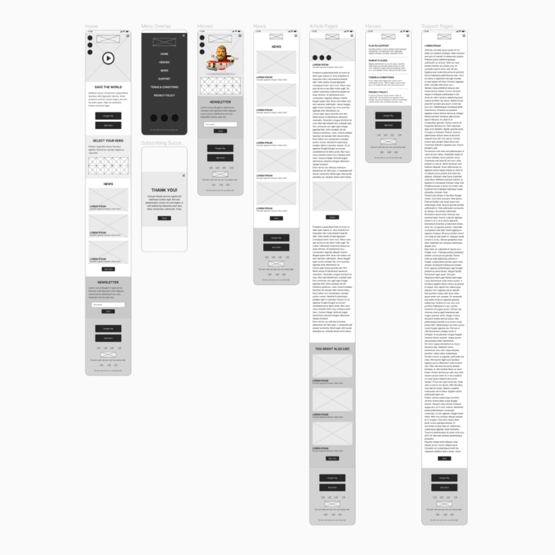
Lo-fi Mobile Prototype
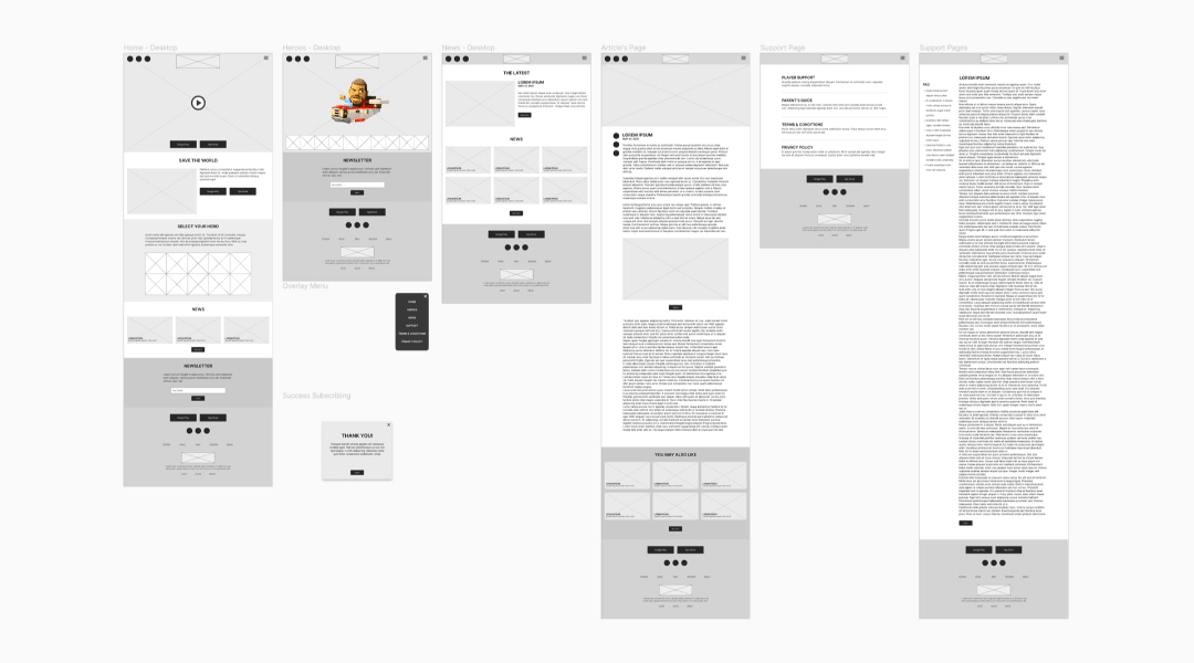
Lo-fi Desktop Prototype

Usability Study
A usability test was conducted to evaluate how effectively the page was guiding visitors to the game's download page on app store platforms, such as Google Play and the Apple App Store. The objective was to create more effective design strategies based on our observations and the user feedback. The insights gained from this study helped to move the designs from initial wireframes to mockups, ensuring a user-focused development process.

Style Guide
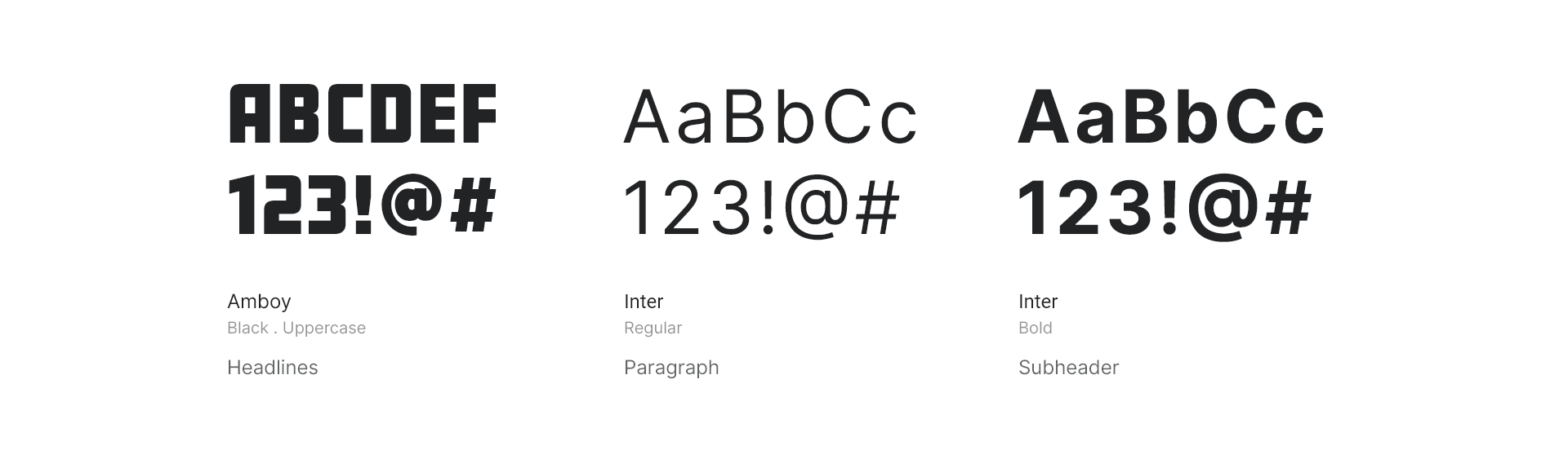
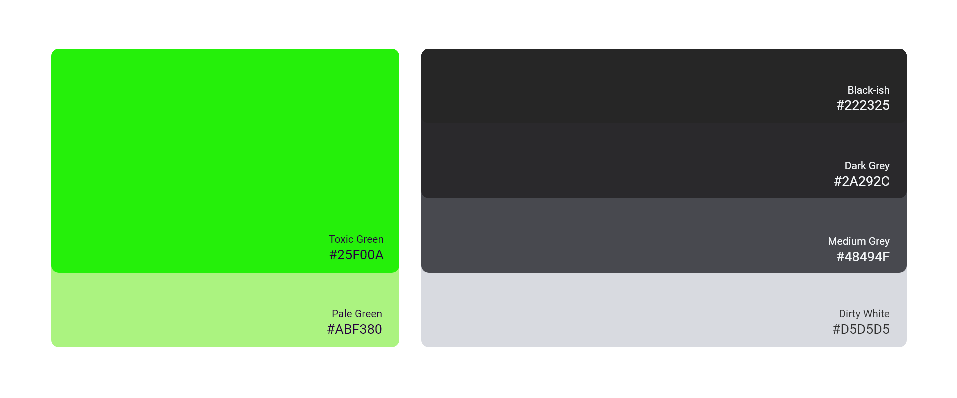
In crafting the website's style guide, the selection of dark grey tones for the background serves a dual purpose: it not only accentuates the content's vibrant colors but also highlights the dynamic green headlines, creating a visual experience that distinguishes the website from the game. The game's distinctive typography, characterized by its boldness and clarity, is preserved in the headlines and titles, ensuring brand consistency. Meanwhile, the paragraph text is rendered in a more readable font, harmonizing with the overall design and enhancing the user's reading experience. This thoughtful approach to design elements—color, typography, and layout—works cohesively to produce an engaging and accessible digital environment.
Typography
Color Palette

Mobile First
In an effort to appeal to the preferences of a younger audience, renowned for their propensity to browse online content via smartphones, a 'mobile-first' design strategy was implemented. This approach prioritizes the optimization of the website's layout and functionality for mobile platforms, thereby guaranteeing a seamless and engaging user experience. By doing so, it not only aligns with the prevalent usage patterns of this audience but also enhances accessibility, ensuring that the website is user-friendly and responsive across all devices. This strategic focus reflects a commitment to meeting the expectations of a tech-savvy generation that values efficiency, speed, and convenience in their digital interactions.
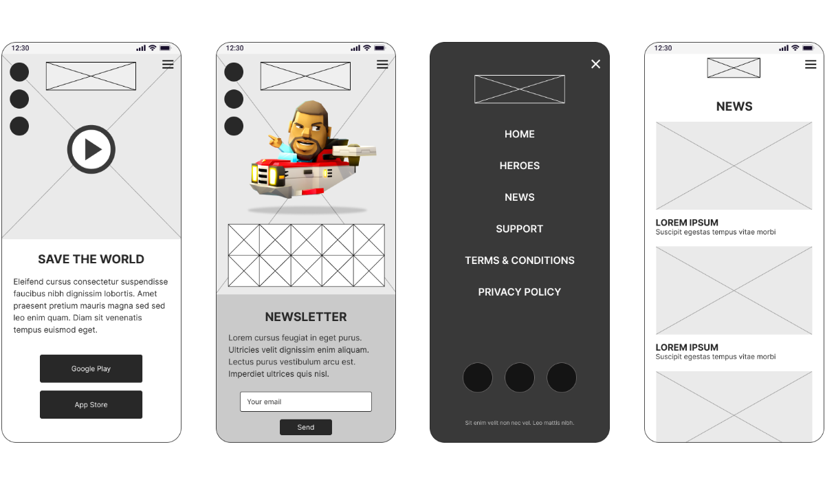
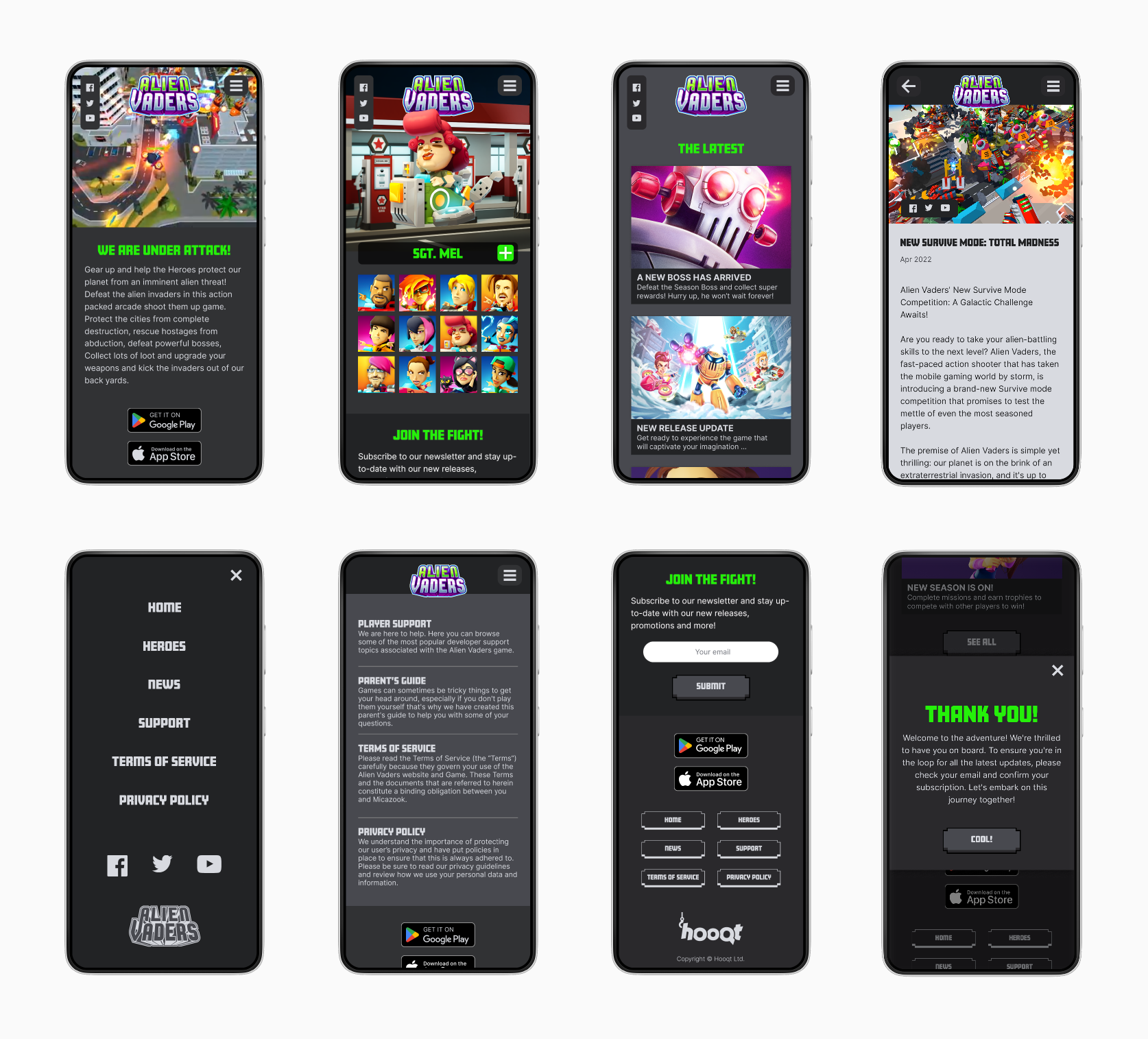
Key Mockups - Mobile
Responsive Design
In the development of my mockups, I considered various screen sizes, aligning them with the wireframes designed in the initial stages. This approach was to guarantee that the user experience remains seamless and intuitive across all devices. By creating a responsive design, I aimed to provide users with the flexibility to interact with the interface effortlessly, whether they are on a desktop, tablet, or mobile phone. The goal was to create a universally accessible and user-friendly page, accommodating the diverse ways individuals engage with technology nowadays.
Key Mockups - Desktop

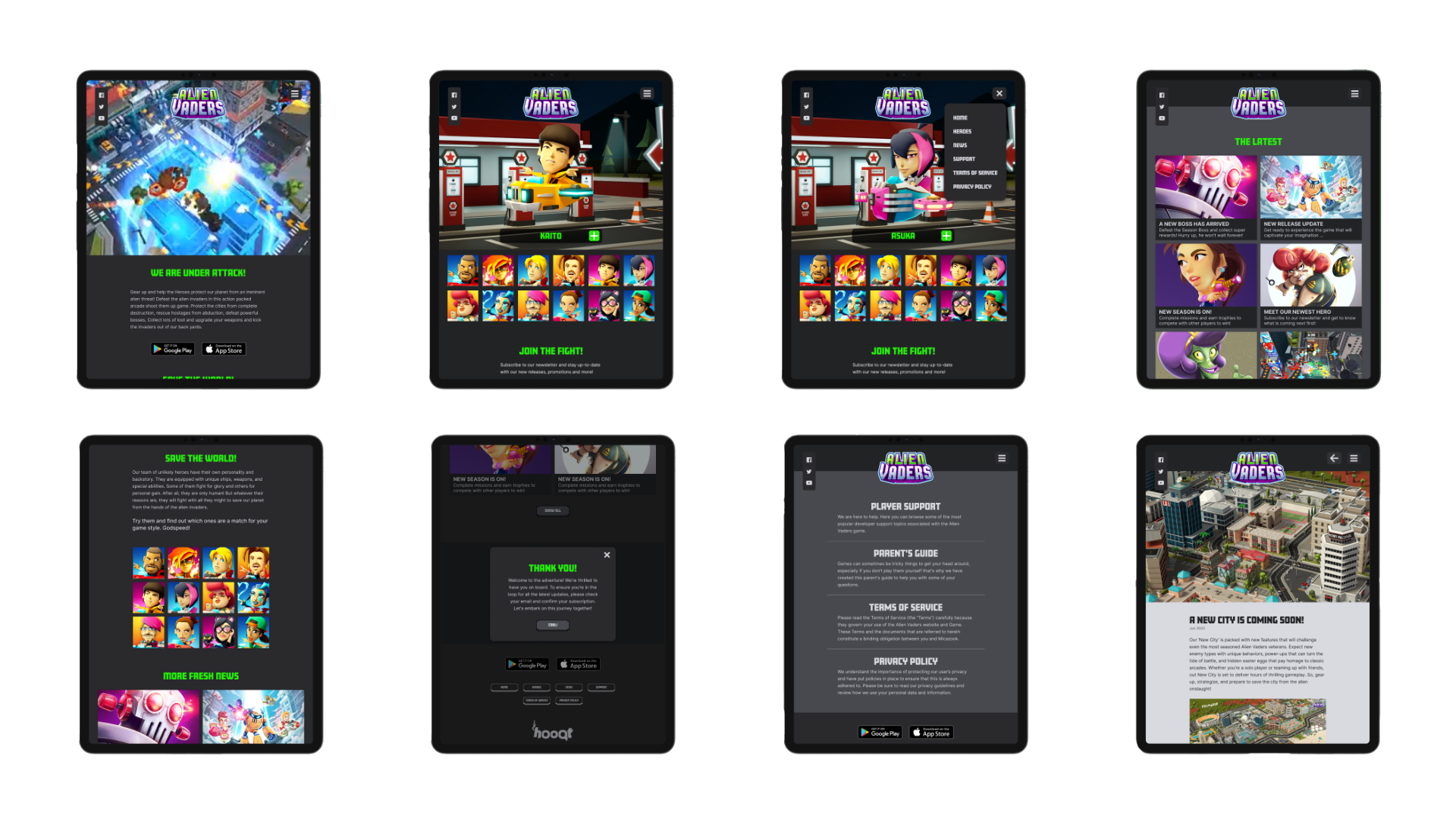
Key Mockups - Tablet
Heroes and Power-ups
'Alien Vaders' offers an extensive range of heroes, each bringing a unique dynamic to gameplay. The choice of hero is not just a matter of preference but strategy, as each hero can significantly alter the player's approach. Recognizing the heroes' pivotal role, we've dedicated a special section on our website to showcase them. This feature mirrors the in-game hero selection, providing an immersive experience that extends beyond the game. As the lead character designer, I crafted every detail of these characters, from their visual design to the icons representing their special abilities. This dedication to character creation is now vividly displayed for players to explore and appreciate on our website.
Further details on the hero selection and its adaptation to the website for various screen sizes are available in the prototypes provided below.
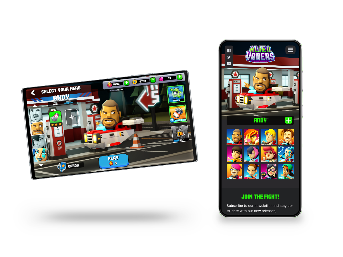
Above, the hero selection is displayed for both the game and the mobile phone website.
High-Fidelity Prototypes
I developed a high-fidelity prototype for mobile phones that aligned with the user journey outlined by the low-fidelity version. Integrating design enhancements informed by the usability study, and further I refined the prototype based on the feedback received to ensure a more intuitive user experience and adjusted my designs for different screen sizes.
Hi-fi Prototype - Mobile
Hi-fi Prototype - Tablet
iPad Pro 12.9"
Hi-fi Prototype - Desktop
Surface Pro 8

Conclusion
Alien Vader's website effectively captured the essence of the game, and our user testing has demonstrated that the website's navigation is both clear and user-friendly. Additionally, we have effectively developed a page that encourages visitors to download the game.
However, if I could do this project again, there are a few things I would consider for future iterations to optimize user engagement and conversion rates. Designing the website concurrently with game production presented significant challenges, particularly in maintaining visual consistency as the game evolved. In hindsight, committing to a design direction was necessary, though it resulted in greater difference between the game and website than desired.
Additionally, incorporating a blog section could have provided users with valuable insights into the game's development, regardless of their subscription status to our newsletter.
Finally, enriching the user experience with interactive animated heroes uttering key phrases could have fostered a stronger connection between the players and the heroes.

LET'S CONNECT!
Thank you for your interest in my work! Should you have any inquiries or wish to share some thoughts, please don't hesitate to reach out.