
Project Overview
About
Cine Retro is a developing project of small movie theater and bar that specializes in screening cult and classic films that have stood the test of time. Whether you're into horror, comedy, drama, or sci-fi, you'll find something to suit your taste. You can watch iconic movies like Psycho, The Life of Brian, Breakfast at Tiffany's, or Blade Runner on the big screen, with high-quality sound and projection. And if you want to share your thoughts and opinions with other film enthusiasts, you can join them at the bar and cafeteria, where they offer a variety of tasty food and beverages. You can also browse through their collection of movie memorabilia and posters. Cine Retro is not just a place to watch movies, it's a place to celebrate cinema.

Project Duration
June 2023 - 3 weeks
Tools
Adobe XD, Figma, Adobe Photoshop and Adobe Illustrator
My Role
UX/UI designer and researcher leading the Cine Retro website design.
Responsibilities
Conducting interviews, creating paper and digital wireframing, low and high-fidelity prototyping, conducting usability studies, accounting for accessibility, iterating on designs and responsive designs.
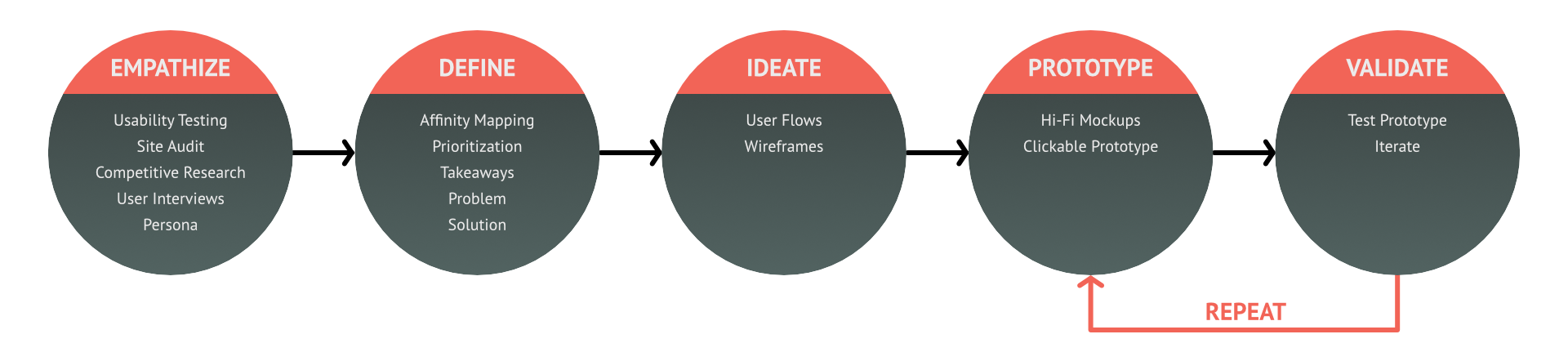
Cine Retrô Design Process
The Cine Retro website's design process adopts a user-centric approach, empathizing with movie enthusiasts to define clear objectives, ideating innovative solutions, and prototyping responsive designs. This is followed by usability testing to validate and ensure an intuitive and enjoyable experience for users.


Problem
A frequent issue faced by users booking movie tickets online is the poor design of many websites. These sites often feature cluttered interfaces, complicating navigation and the search for movies that align with the user's tastes. Consequently, this can lead to a frustrating and lengthy process for individuals seeking a hassle-free movie-going experience.
Goal
Our goal is to design a responsive website that is both intuitive and user-friendly, it is crucial to cater to the specific needs of our target audience. Our design choices will be informed by our research findings to ensure the website is not only easy to navigate but also visually pleasing.

Understanding the user
User Research
Summary
We Conducted interviews, which turned into empathy maps to better understand the needs and pain points of our target users. It was discovered through our interviews that most users cannot easily find movies that match their interests, time, and location. They must browse through different apps or websites and compare the available options, which can be frustrating and time-consuming.

Pain Points
1. Time
Cinema websites often have pages cluttered with lots of information, leading to confusing navigation and a time-consuming process to sift through films to find one that matches your interests, timing, and location.
2. Interface
Many cinema websites suffer from a poor design that hinders the user experience. It is difficult to find the movies that are currently playing and their showtimes.
3. Grouping Experience
Cult movies have a loyal fanbase but are ignored by the mainstream. However, the cinemas that show these old and cult classics do not provide any ways for their customers to connect with other fans who appreciate these movies.
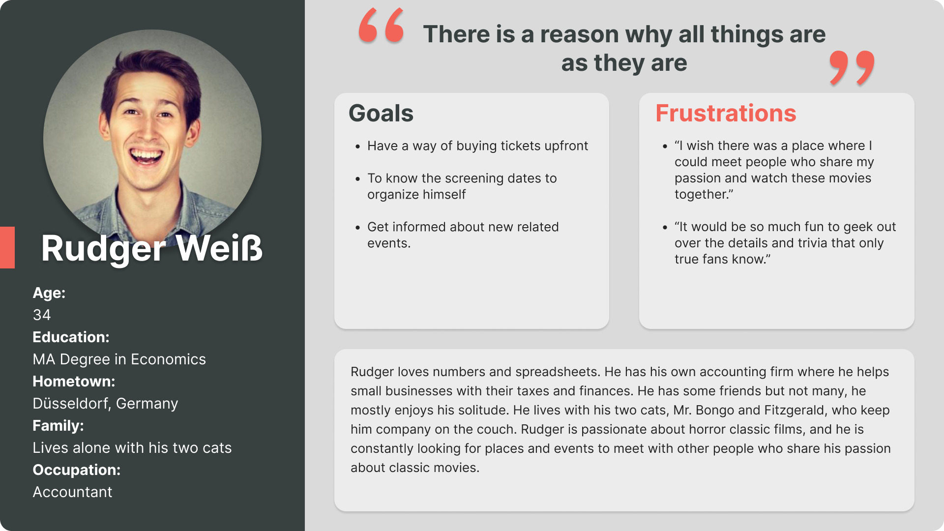
Personas
To design our product, we developed personas that represented the characteristics of our potential customers. We focused on capturing the enthusiasm for classic and niche movies, regardless of age or social status.
Rudger was our primary persona. He loves numbers and spreadsheets. He has his own accounting firm where he helps small businesses with their taxes and finances. Rudger is passionate about classic horror films, and he is constantly looking for places and events to meet with other people who share his passion about classic movies.
As we moved on in our design process, we made sure to keep his needs and concerns front and centered.
User Persona
Problem Statement
Rudger is a busy professional who needs an easier way of finding old movies and events related and book tickets way upfront because he wants to have a good night out with his friends that share his passion for oldies and make sure everyone can fit the dates into their busy schedule.
User Journey Map
I created a user journey map of Rudger's experiences using the website to help identify possible pain points and improvement opportunities.

Site Map
One of the main user complaints was the difficulty of finding films in the catalogue, so I used this insight to design a sitemap.
I aimed to simplify the navigation through the content and enhance the overall website usability. The chosen structure was intended to make the flow as smooth and straightforward as possible.


The Design
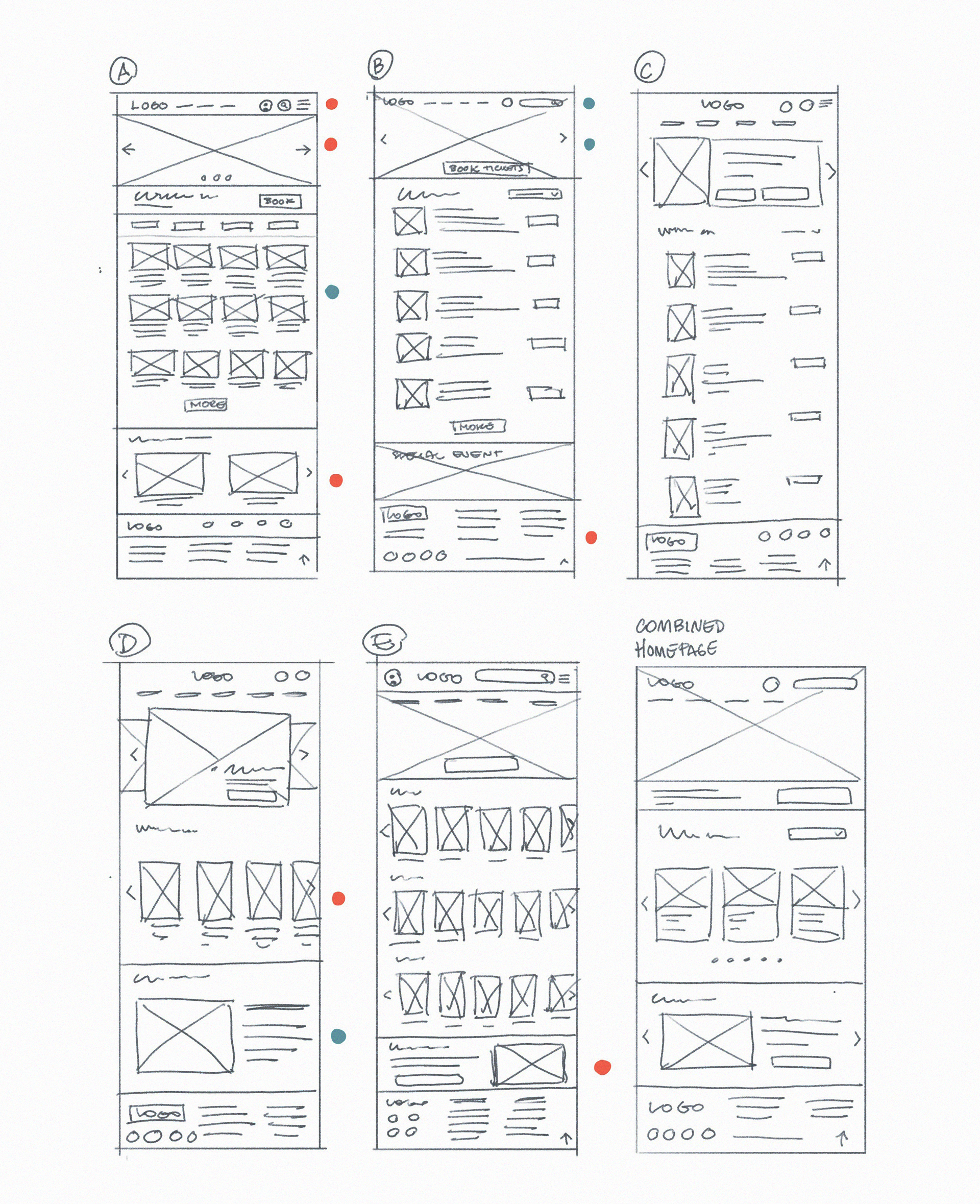
Paper Wireframes
Desktop Layout
To alleviate user difficulties in navigating the film catalogue, I have designed wireframes for each website page. Additionally, I have contemplated enhancements to the online ticket booking process, from film selection to checkout. The various homepage wireframe designs presented below aim to streamline the navigation and browsing experience.
Red and blue dots indicated the sections of each sketch designated for the initial digital wireframes. Red dots represented the primary choices, while blue dots highlighted the suitable alternative options.
Screen Size Variations
Tablet and Mobile Layout
To guarantee a fully responsive website for Cine Retro's diverse device-using clientele, we initiated the expansion of our designs to accommodate multiple screen sizes.

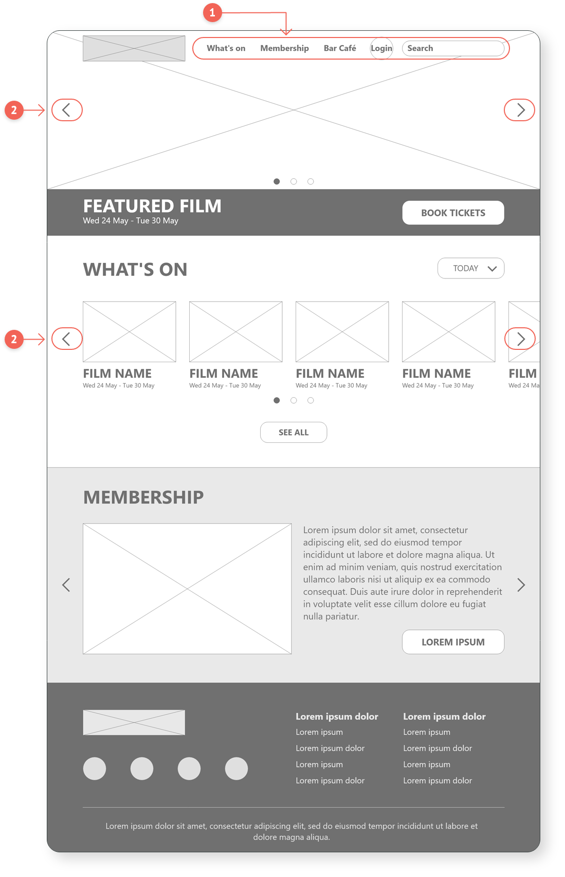
Digital Wireframes
Transitioning from paper to digital wireframes allowed us to visualize how the redesign could address user issues and improve the overall user experience.
We focused on placing buttons and visual elements on the home page in a way that would address the user's needs.
1. Easy access to the most used buttons.
2. Improved film browsing through carousel of images straight from homepage.
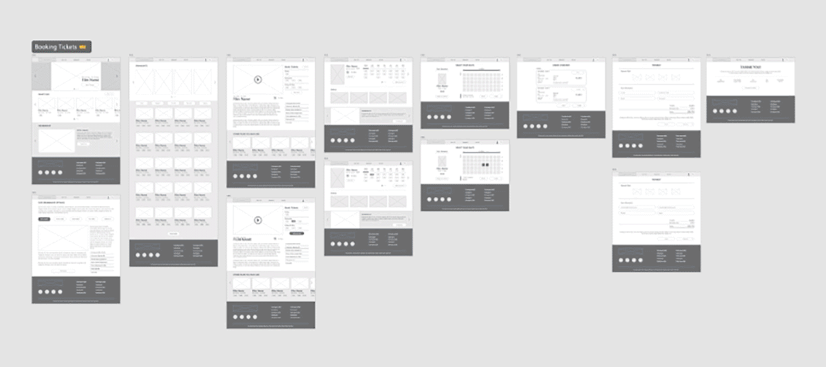
Low-fidelity Prototype
To create a low-fidelity prototype, I connected all screens involved in the primary user flow of adding an item to the cart and checking out. At this point, I had already received feedback on my designs from members of my team about things like placement of buttons and page organization. I made sure to listen to their feedback, and I implemented several suggestions in places that addressed user pain points.

Usability Study
The main goal of this study was to evaluate the usability and effectiveness of the ticket booking system. The focus was on gathering deeper insights into user preferences and challenges to offer them tailored design solutions. The findings from this study helped guide the designs from wireframes to mockups.

Study Type
Unmoderated Usability Study
Location, Dates and Length
Duesseldorf, Germany Remote
June 6 and 7, 2023
30 - 45 minutes per participant
June 6 and 7, 2023
30 - 45 minutes per participant
Participants
Six (6) participants
Two males, two females, a nonbinary individual, and a person with hearing impairment. All participants are between 30 and 65 years old.
Two males, two females, a nonbinary individual, and a person with hearing impairment. All participants are between 30 and 65 years old.
KPIs
Time on task
Conversion rates
System usability scale
Conversion rates
System usability scale

Insights
1. Screening Times
Lack of information about dates and screening times on the main page. Users had to click on each film to see when and where it was playing. This could lead to disappointment if the available options did not suit their preferences.
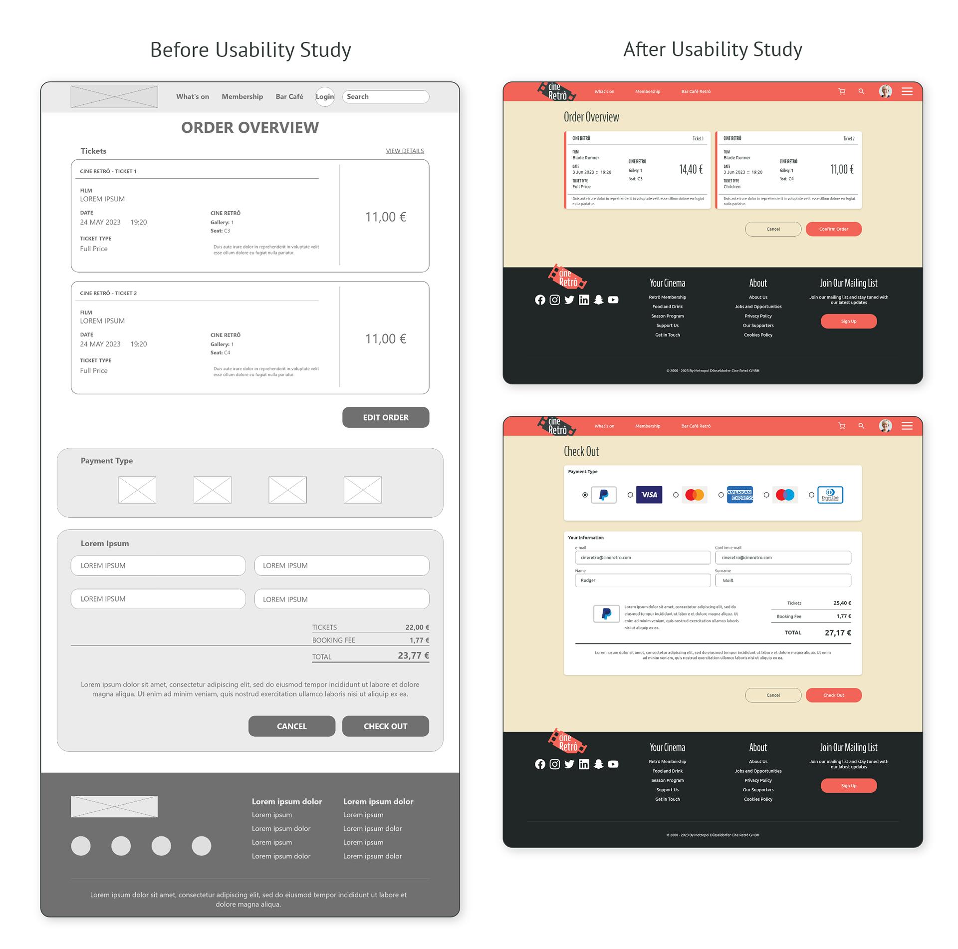
2. Overview and Checkout
Combining the overview and checkout sections on one page resulted in confusion and frustration for most participants.
3. List of Films
The film list was not well-organized and lacked clarity, which hindered the user experience when exploring the attractions.


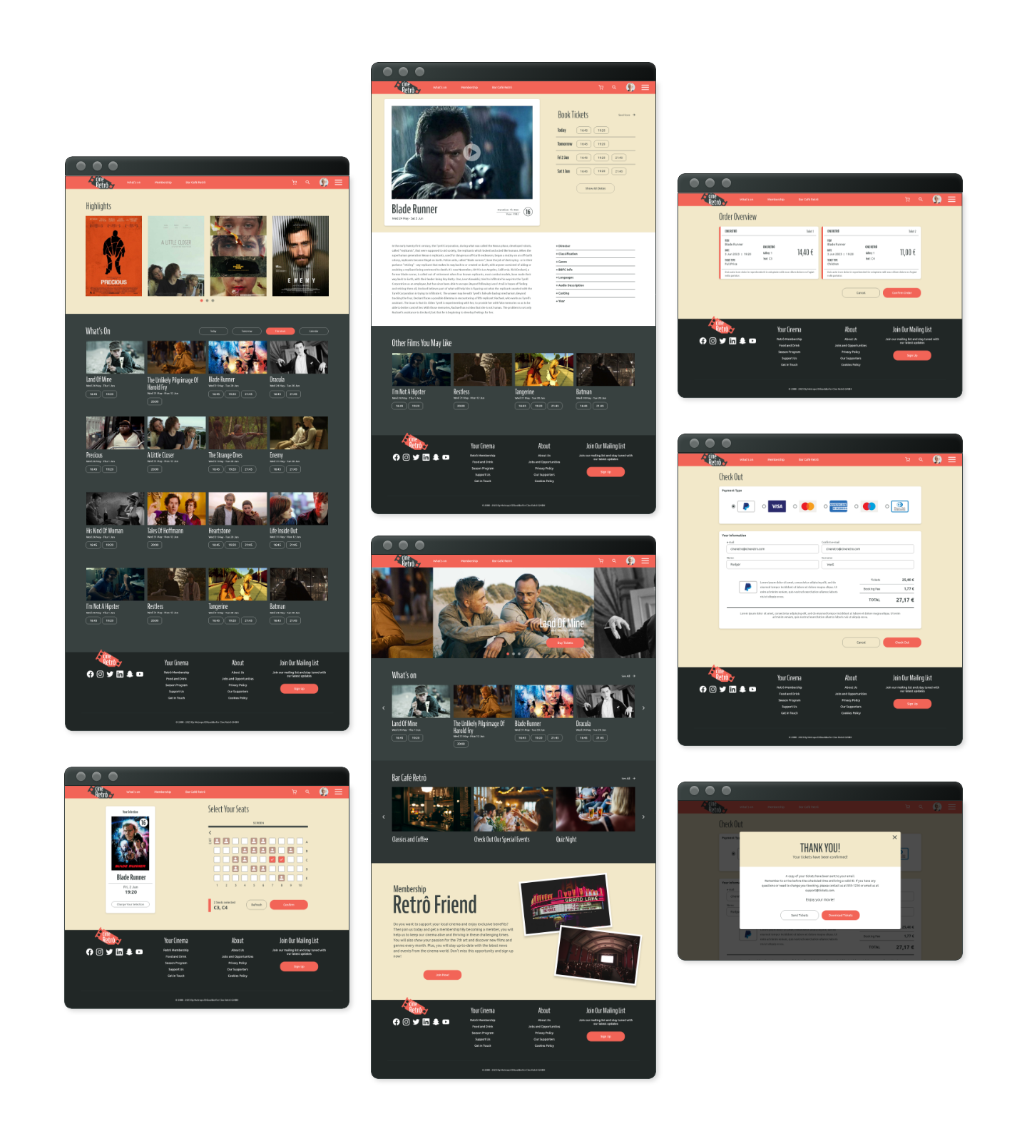
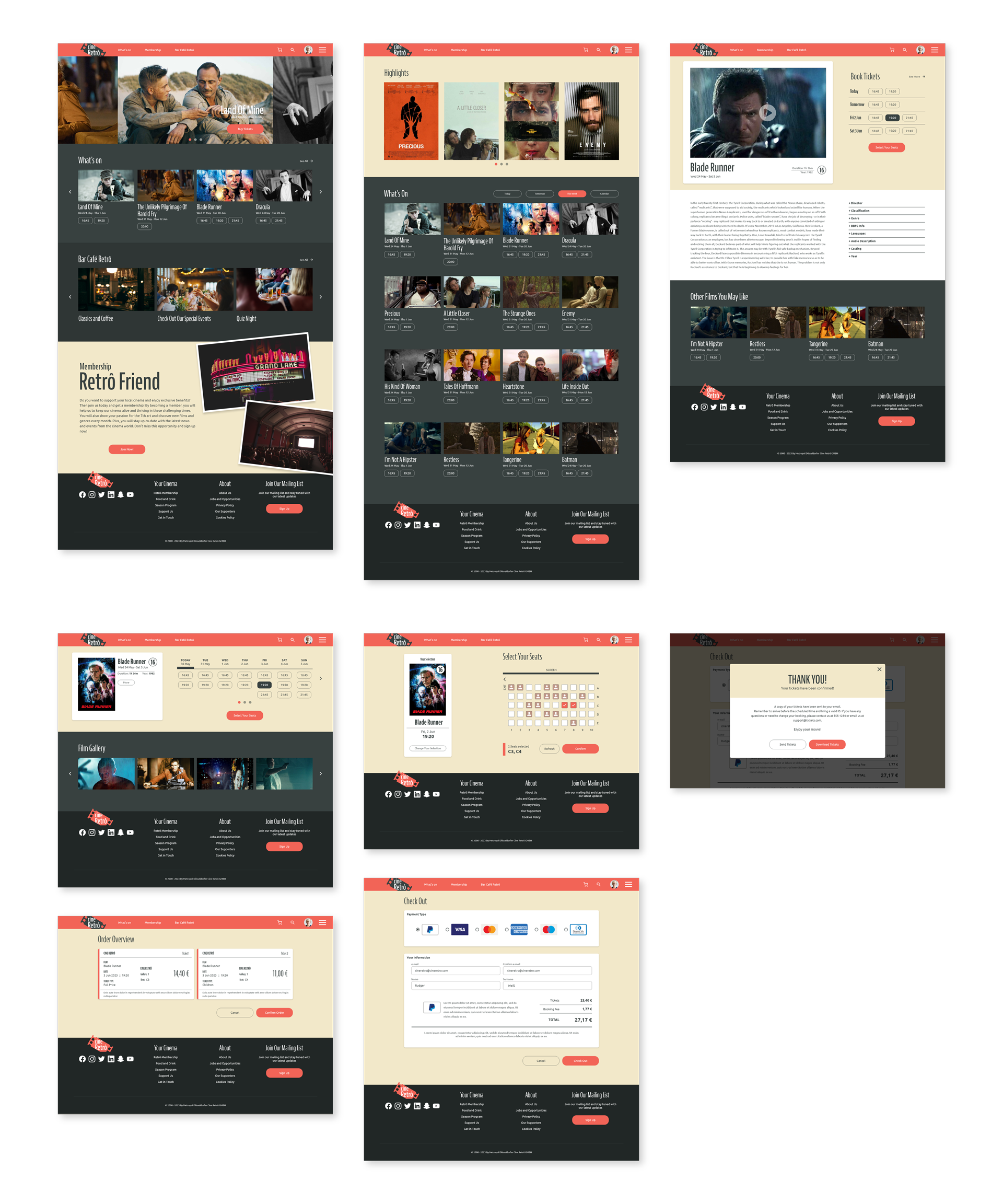
Mockups
I used the insights from the usability study to improve the website's navigation and the booking tickets flow. The improvements include the payment system, the content browsing experience of the films on display, and the times related to the movies.
1. The first improvement was to add the screening times under the films. This way, users can quickly see the available times for each movie.
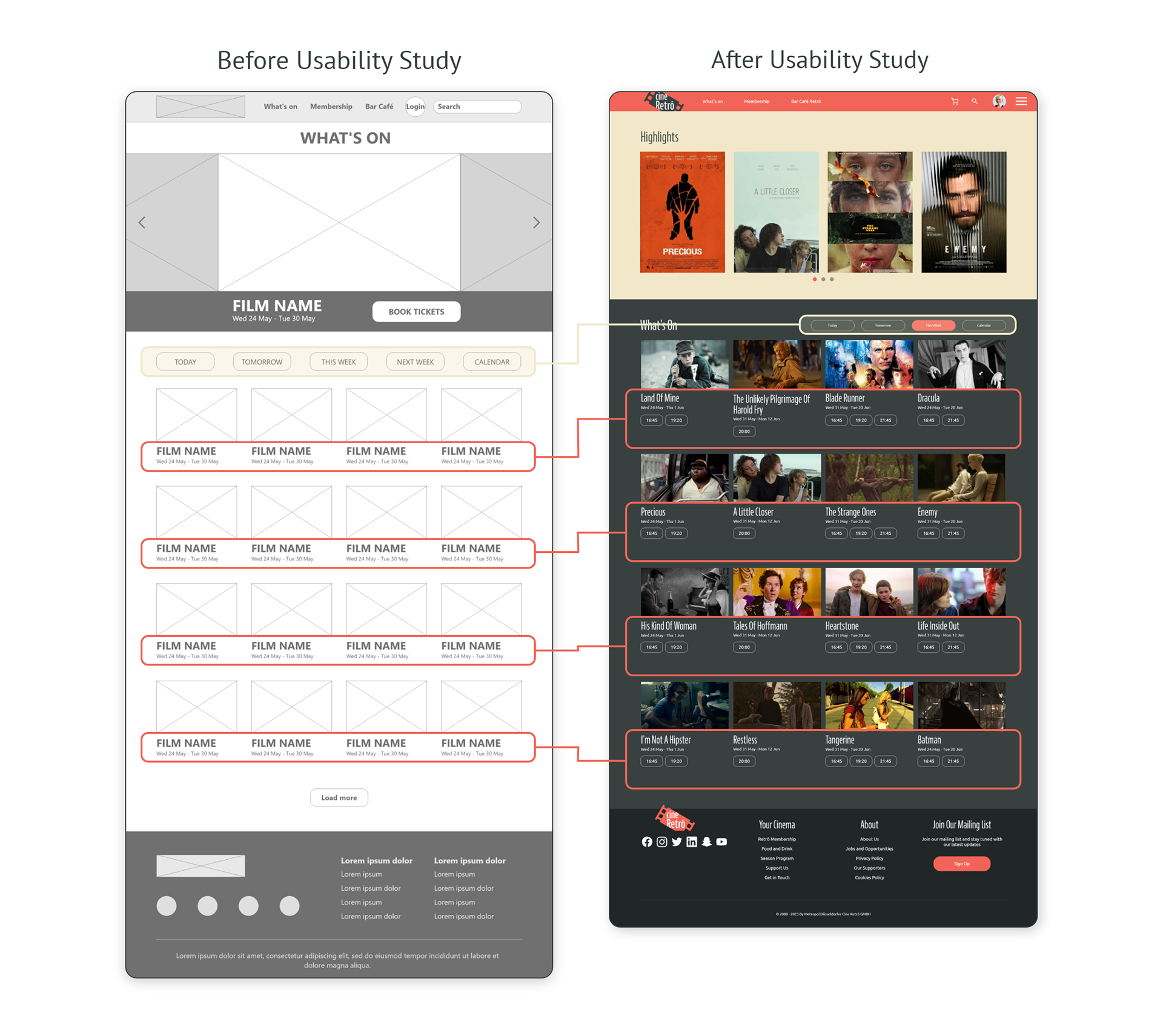
2. The second improvement was to redesign the films' page. I made it clear and easy to navigate through the information and added the screening times.
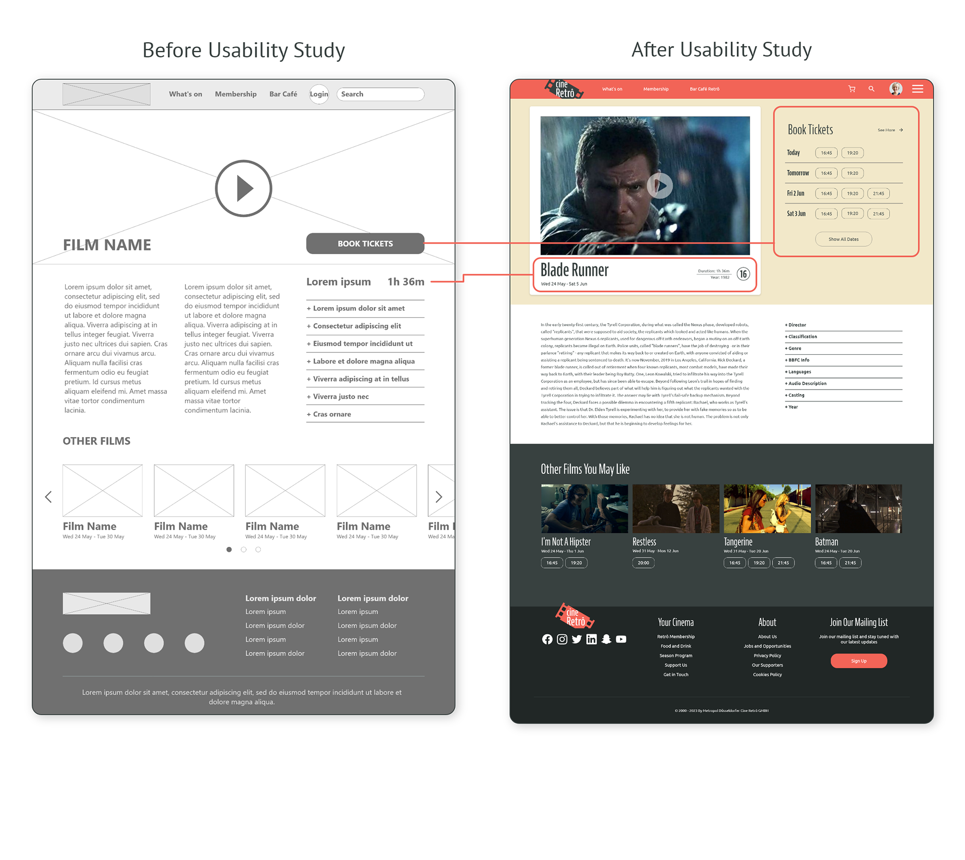
3. The third improvement was to separate the overview page from the checkout. This allows users to review their order and make changes before proceeding to payment.

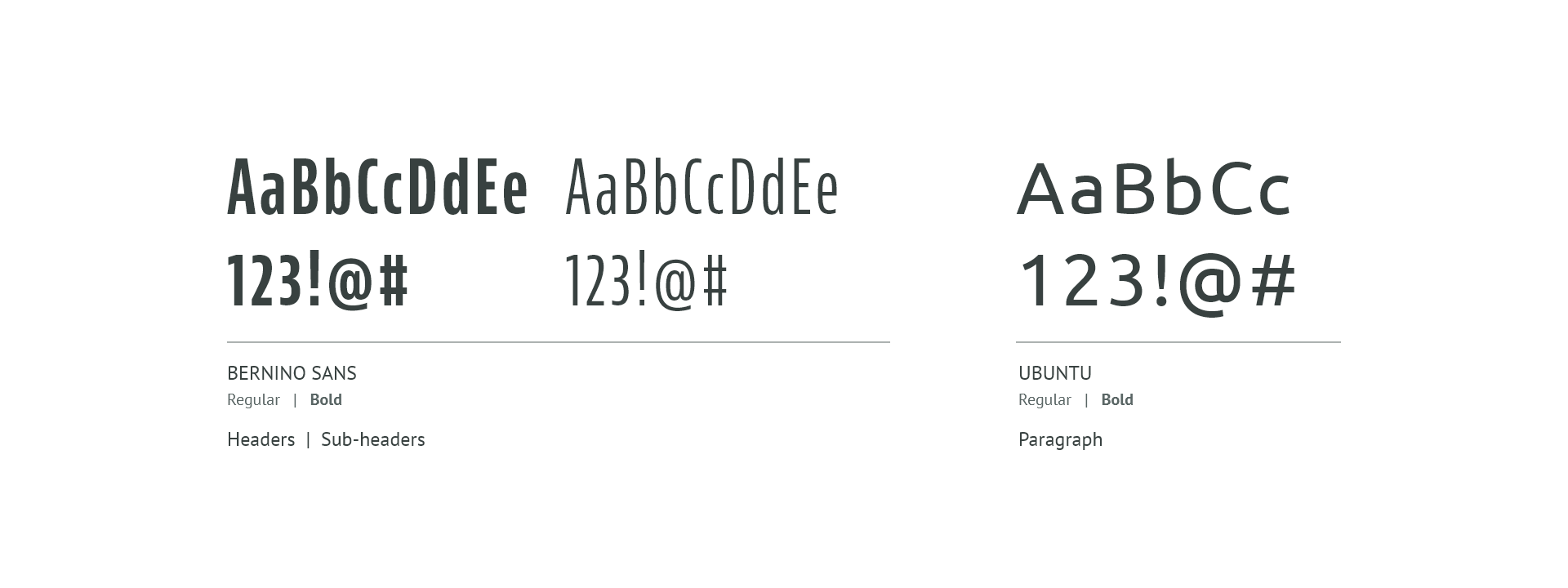
Style Guide
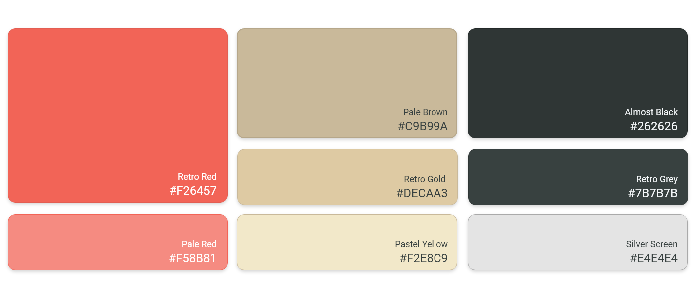
Color Palette
Typography

Original Size Mockups
Desktop
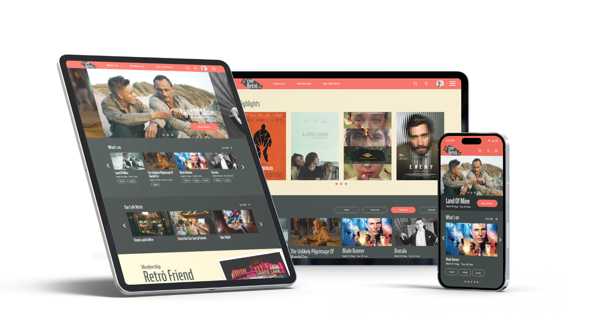
Tablets and Mobile Phones
My mockups incorporated different screen sizes based on the wireframes I created earlier. I wanted to ensure that users can navigate comfortably from various devices, such as mobile phones and tablets, by optimizing the browsing experience for each device size.

High-fidelity Prototype
I developed a high-fidelity prototype that was consistent with the user flow of the low-fidelity prototype. I incorporated the design modifications that resulted from the usability study, and made some adjustments based on the feedback I received.
XD File - Hi-Fi Prototype

Booking Ticket Flow
The following video showcases the process of selecting a film and the checkout procedure on the desktop version of the Cine Retrô website.
Accessibility Considerations
1. I used headings with different sized text for clear visual hierarchy.
2. I used landmarks to help users navigate the site, including users who rely on assistive technologies.
3. I designed the site with alt text available on each page for smooth screen reader access.

Takeaways
Impact
Our user testing revealed that our website's navigation is clear, engaging, and intuitive. Moreover, we successfully designed the ticket booking flow to adapt to the user's interaction with the website.
What I Learned
This project has taught me the value of empathizing with your users and finding out their true needs.
Design solutions should not be based on assumptions, but on user research and feedback.
Even small tweaks in the design can make a big difference to the user experience and satisfaction.
Design solutions should not be based on assumptions, but on user research and feedback.
Even small tweaks in the design can make a big difference to the user experience and satisfaction.
Next Steps
1. Conduct follow-up usability testing on the latest designs of the website.
2. Identify any areas of need and make changes to the design to address them.
3. Ideate and work on new features.

LET'S CONNECT!
Hey, thanks for checking out my work.
I have always been captivated by how people engage with technology. I am especially interested in digital products that are created to help in our everyday life.
Should you wish to learn more about my design process, or if you're interested in discussing a cool concept, please feel free to contact me.